WordPress Glossary Plugin (CMTG) - Index - Index Templates
Glossary Index Templates
Version Availability
Different versions of the WordPress Glossary plugin have different amount of available display views:
- Free version - Classic view.
- Pro version - Classic view, Small Tiles view. Can only use one.
- Pro+/Ecommerce - All 21 views. Can use one (via settings) or multiple (via shortcode).
The Glossary Index Page is where all your glossary terms are gathered for quick reference. Check some of the templates:
Changing the Template - Pro+/eCommerce Edition
The setting is always in the Glossary Index Page tab in your plugin settings. However, it's slightly different in the Pro version.

Pro Edition
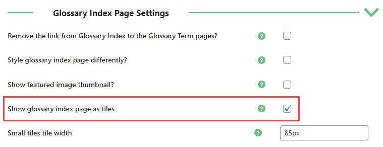
- Show glossary index page as tiles
- Disabled - Classic View
- Enabled - Small Tiles view
Pro+/Ecommerce Edition
The option is the Display style dropdown.
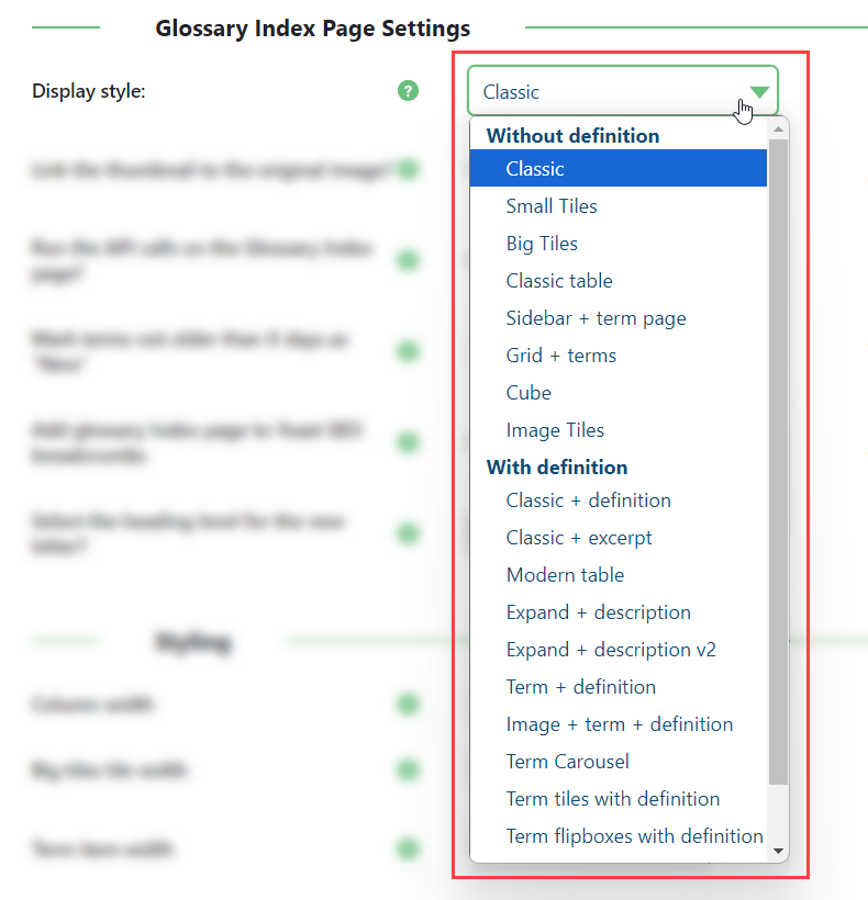
List of Templates
| Template Name | Description | Present in | glossary_index_styles attribute |
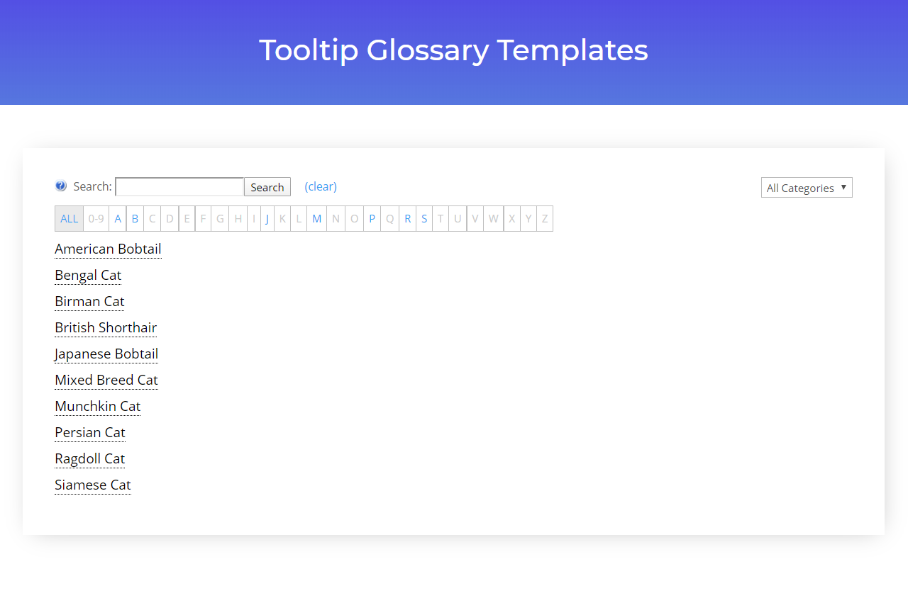
| Classic | Plain list of the terms in alphabetical order. | All versions | classic |
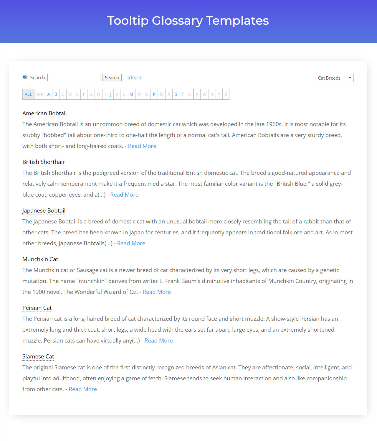
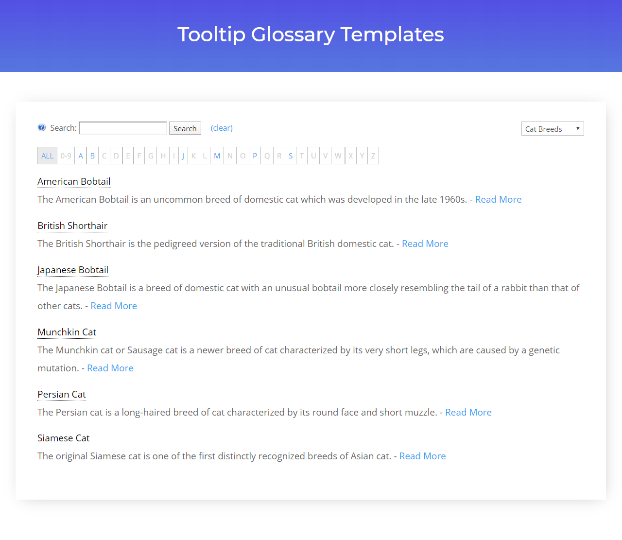
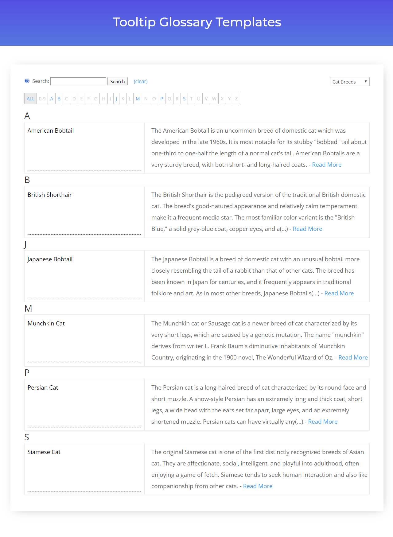
| Classic + Definition | List of terms with their definitions, in alphabetical order. | Pro/Pro+/eCommerce | classic-definition |
| Classic + Excerpt | List of terms with their excerpt, in alphabetical order (only applies if you’ve activated the excerpt feature). | Pro+/eCommerce | classic-excerpt |
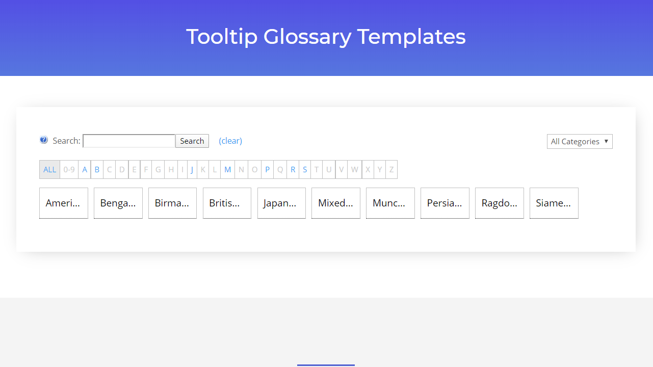
| Small Tiles | Small tiles, in alphabetical order. | Pro/Pro+/eCommerce | small-tiles |
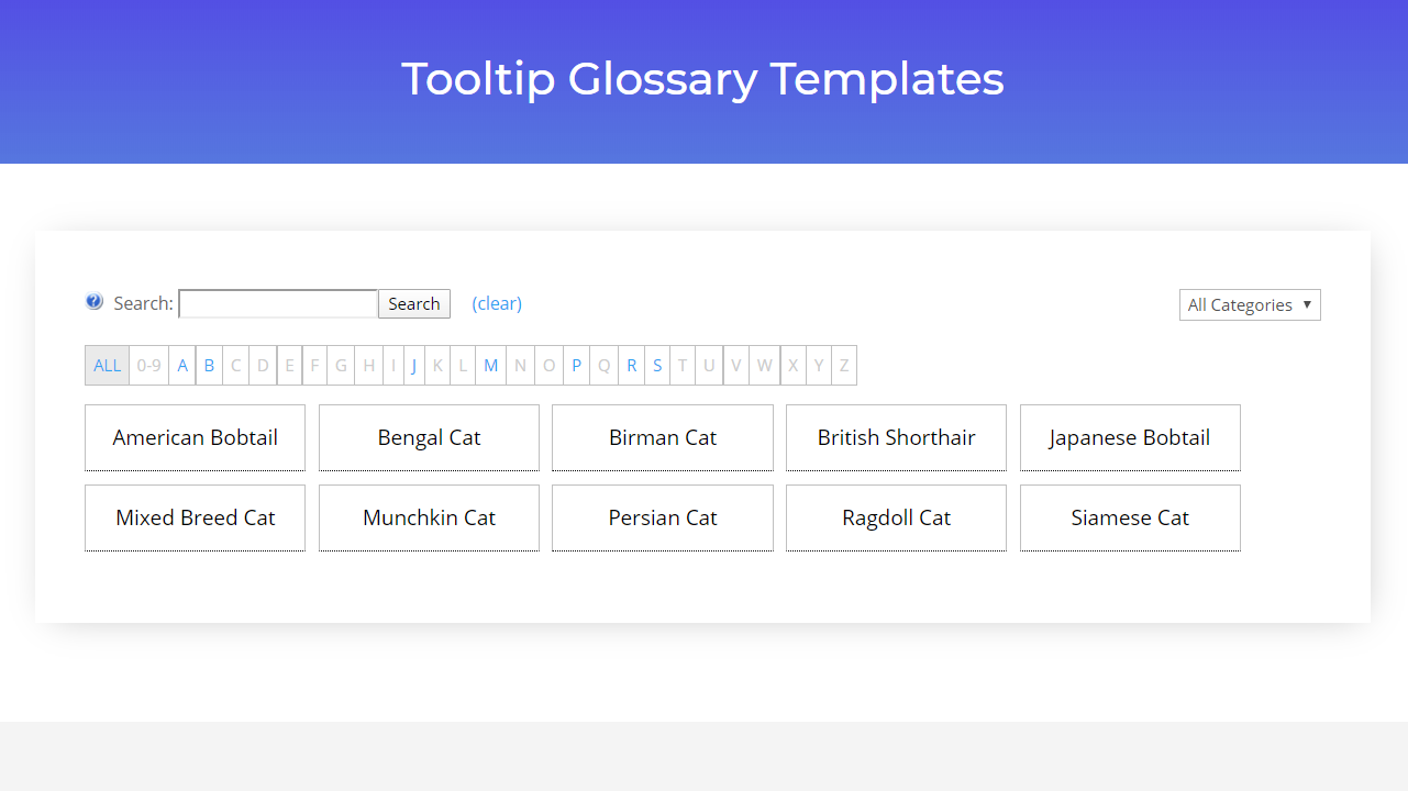
| Big Tiles | Larger tiles, in alphabetical order. | Pro+/eCommerce | big-tiles |
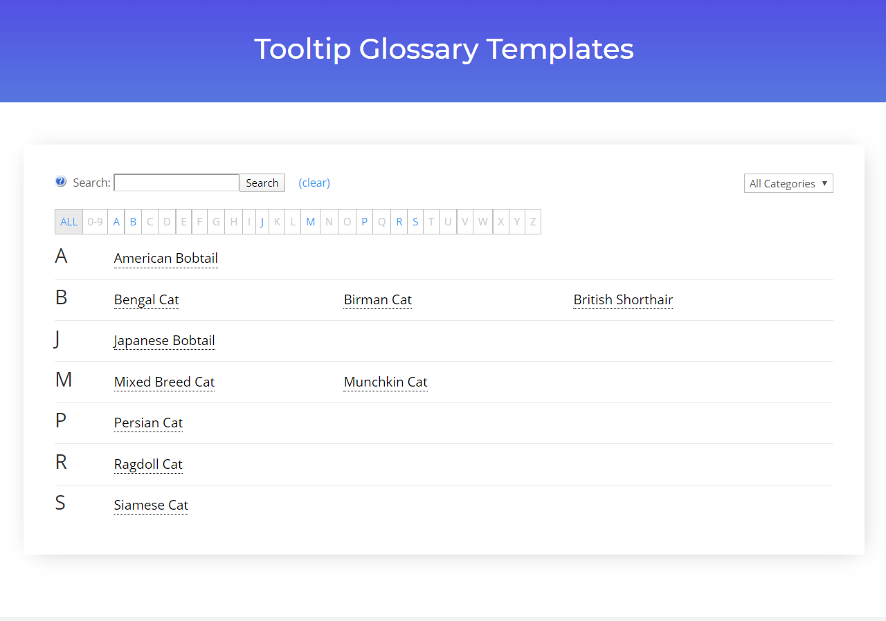
| Classic Table | Alphabetical order inside a plain table. | Pro+/eCommerce | classic-table |
| Modern Table | Alphabetical order inside a modern table. | Pro+/eCommerce | modern-table |
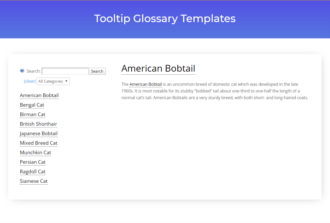
| Sidebar + Term page | Terms are shown on the left side while the term is shown on the right side. | Pro+/eCommerce | sidebar-termpage |
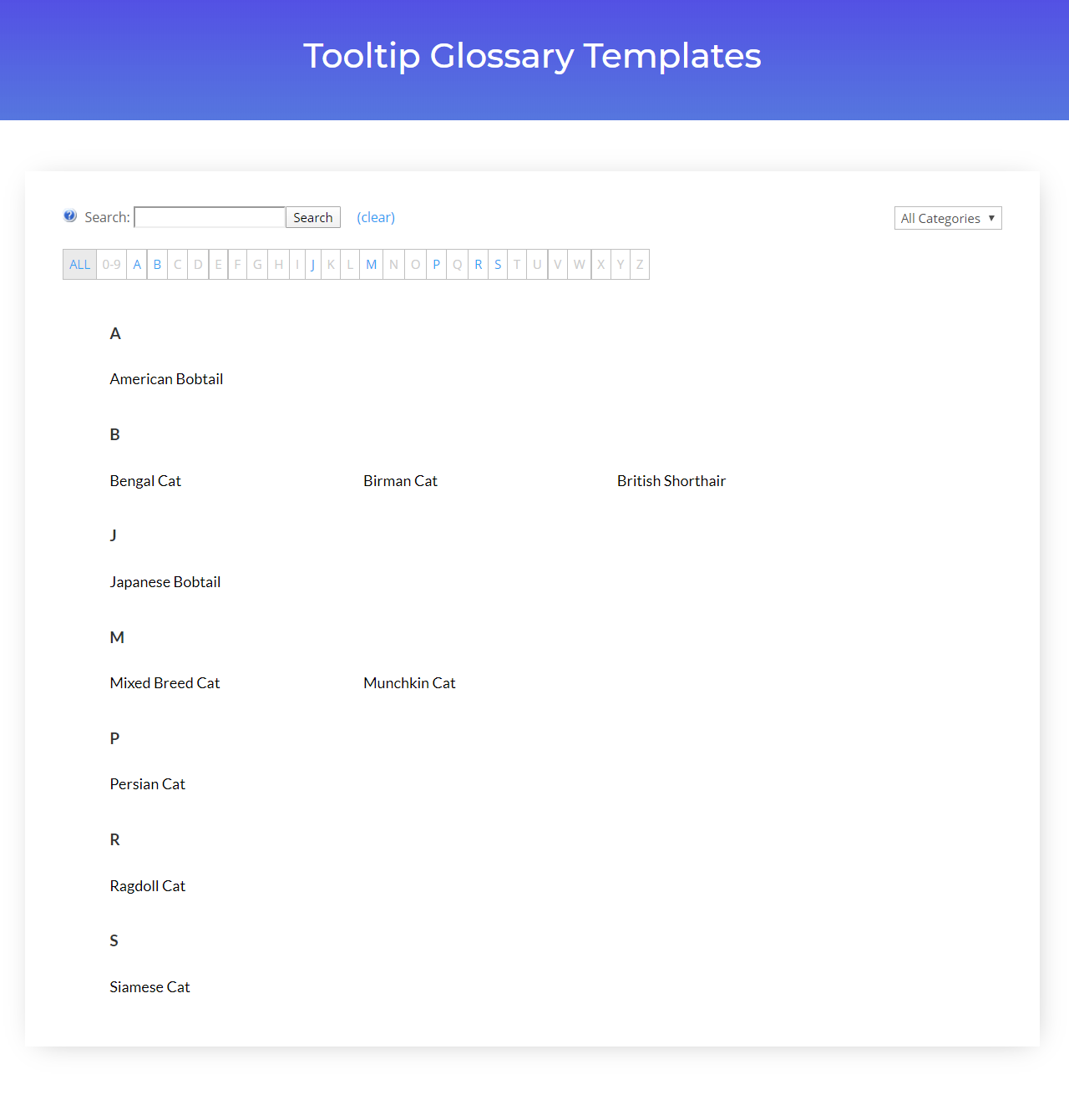
| Grid + Terms | Alphabetical order in a 3 column grid. | Pro+/eCommerce | grid-style |
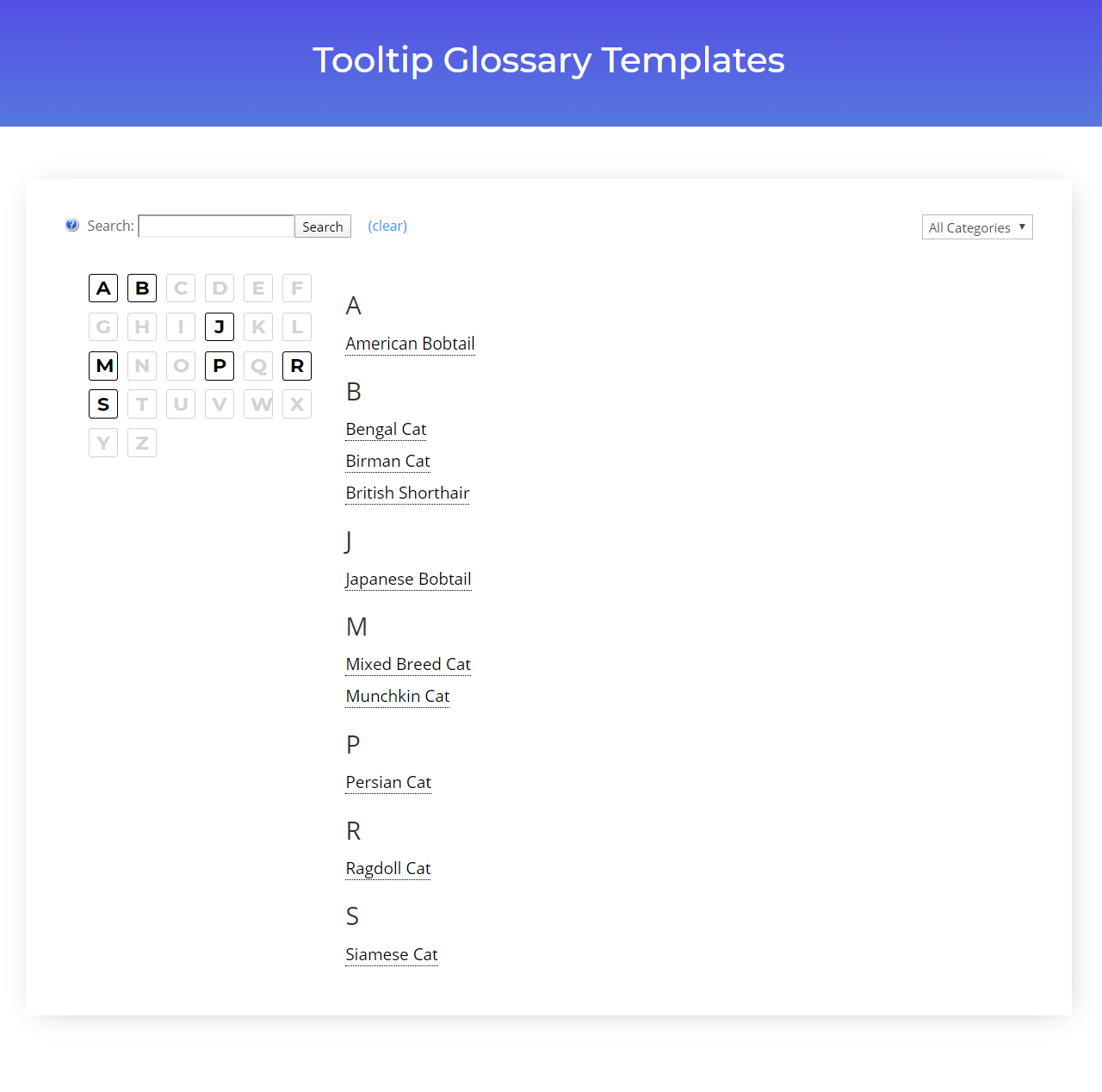
| Cube | Alphabetical index as a cube on the left side, and the terms on the right side. | Pro+/eCommerce | cube-style |
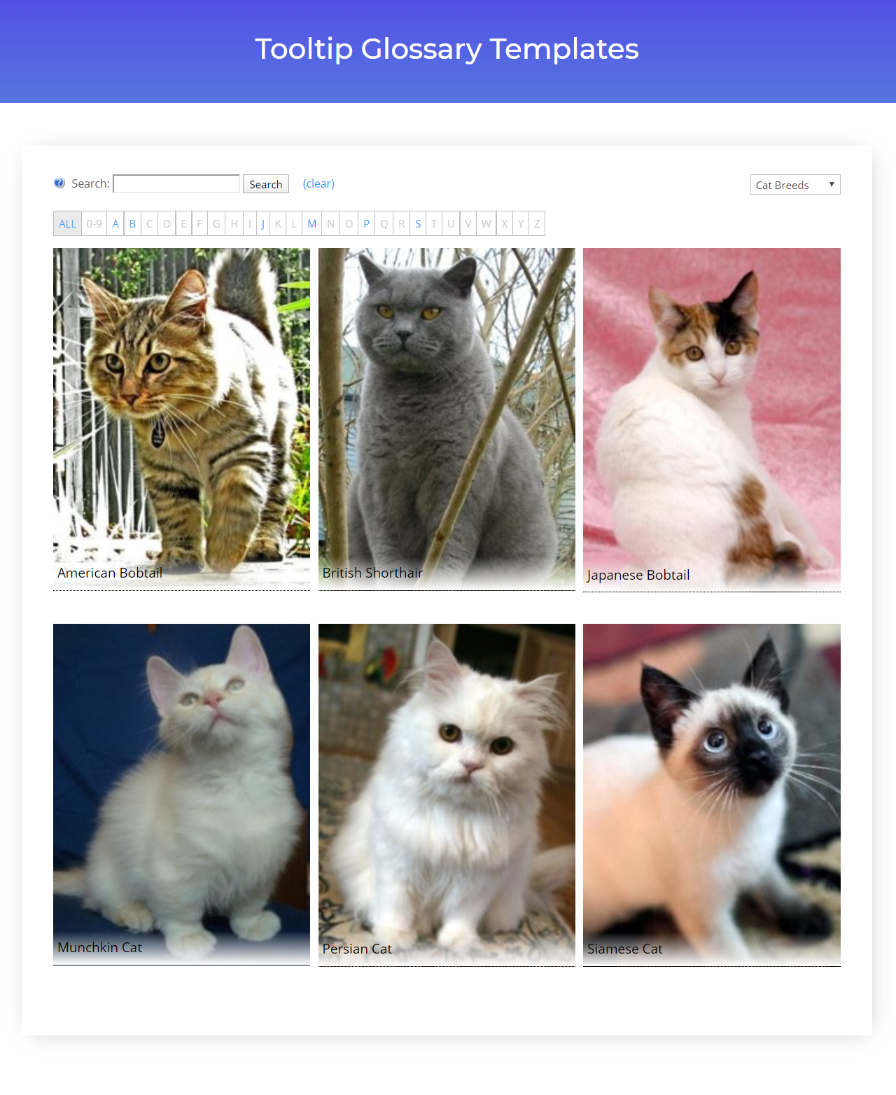
| Image Tiles View | Terms shown in large tiles displaying a featured image or default icon. | Pro+/eCommerce | image-tiles-view |
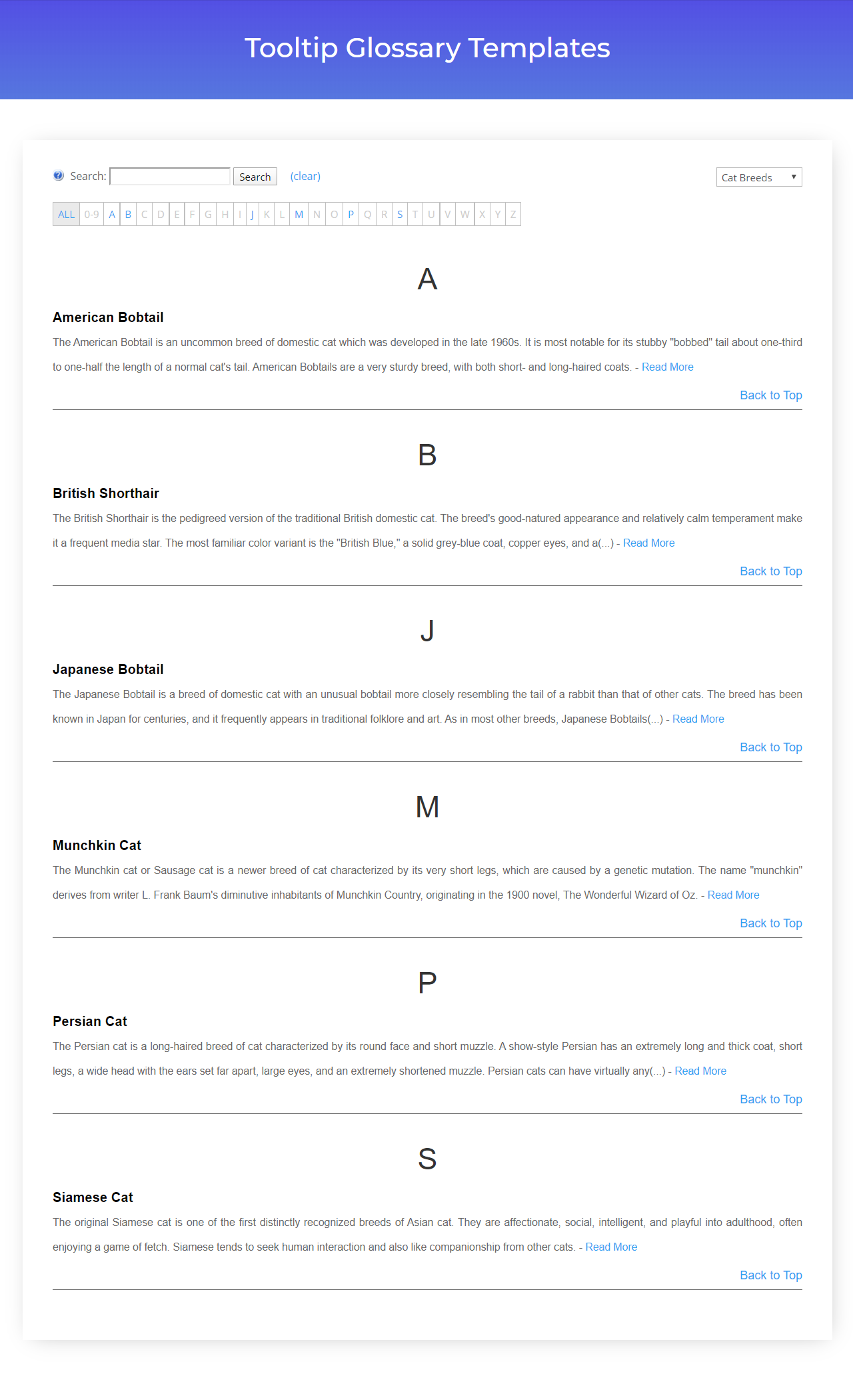
| Expanded View + Description 1 | List of terms in alphabetical order at full width, and the description visible below it. Terms are separated by a solid line and a "Back to top" link. | Pro+/eCommerce | expand-style |
| Expanded View + Description 2 | List of terms in alphabetical order at full width, with the description visible below it. Terms are separated by whitespace only. | Pro+/eCommerce | expand2-style |
| Term + definition | Table with a header, terms and long definitions | Pro+/eCommerce | term-definition |
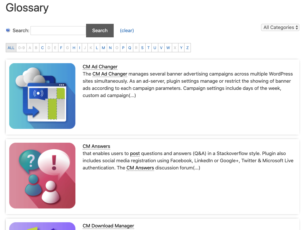
| Image + term + definition | Table with images, terms and long definitions | Pro+/eCommerce | img-term-definition |
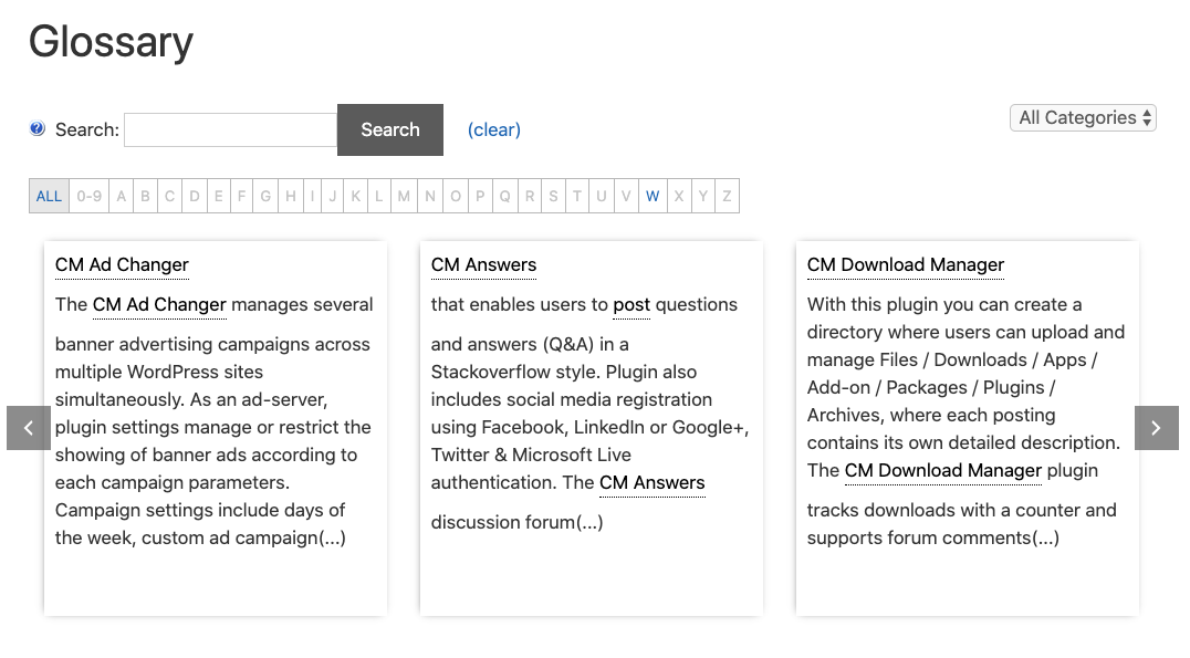
| Term carousel | Scrollable term grid with definitions | Pro+/eCommerce | term-carousel |
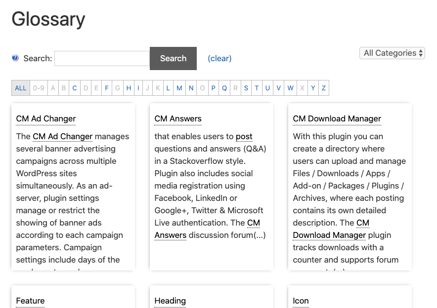
| Term tiles with definition | Tiles grid with definitions | Pro+/eCommerce | tiles-with-definition |
| Term flipboxes with definition | Animated flipboxes with title on one side and description on the other | Pro+/eCommerce | flipboxes-with-definition |
| Accordion View | Accordion view with expandable definitions | Pro+/eCommerce | accordion-view |
| Accordion View 2 | Alternative Accordion view with expandable definitions | Pro+/eCommerce | accordion-view-2 |
| Cards View | Cards with definitions displayed are 3 cards per row. When you hover on some card, it's highlighted with another color. | Pro+/eCommerce | cards-view |
Different Glossaries, Different Templates
In the Pro+/Ecommerce editions, you can modify the look of each glossary by applying attribute glossary_index_style to its shortcode.
The default shortcode is [glossary] and adding an attribute will overwrite the general settings.
For example: [glossary glossary_index_style="modern-table"]
The table above shows which value you should set to output each template.
Classic
[glossary glossary_index_style="classic"]
Classic Definition
[glossary glossary_index_style="classic-definition"]
Classic Excerpt
[glossary glossary_index_style="classic-excerpt"]
Small Tiles
[glossary glossary_index_style="small-tiles"]
Big Tiles
[glossary glossary_index_style="big-tiles"]
Classic Table
[glossary glossary_index_style="classic-table"]
Modern Table
[glossary glossary_index_style="modern-table"]
Sidebar Term Page
[glossary glossary_index_style="sidebar-termpage"]
Grid style
[glossary glossary_index_style="grid-style"]
Alphabetic Cube
[glossary glossary_index_style="cube-style"]
Extra Settings
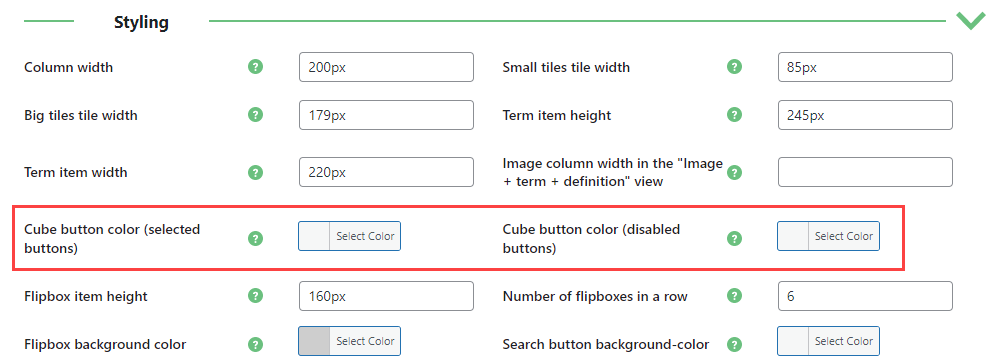
The Cube template has extra settings: you can set the color cube buttons color. If the option is not set, the button color will be black.
You can find them under the Glossary Index Page Settings → Styling section.
Expand view with description
[glossary glossary_index_style="expand-style"]
Expand view with description v2
[glossary glossary_index_style="expand2-style"]
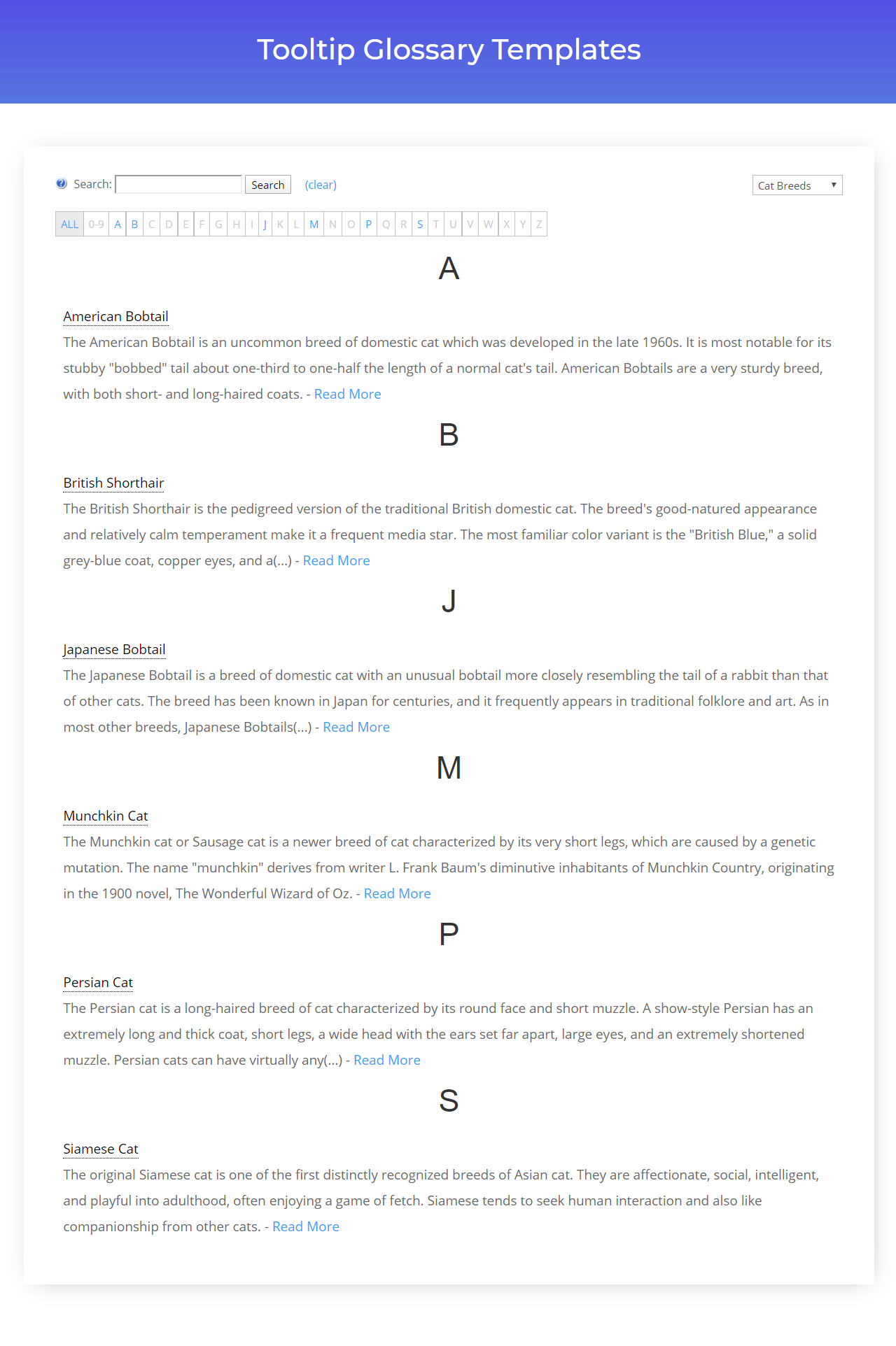
Image Tiles View
[glossary glossary_index_style="image-tiles-view"]
Term + Definition
[glossary glossary_index_style="term-definition"]
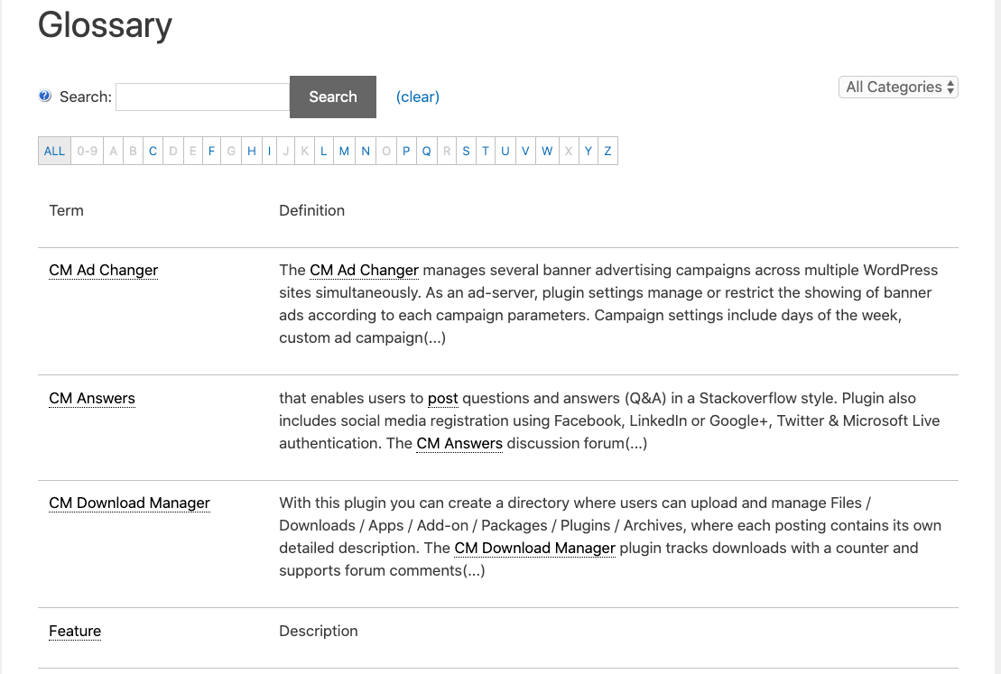
Extra Settings
You can change the column width from the Glossary Index Page tab → Styling section.

Changing the column width

Labels
You can adjust the header labels under the Labels tab in plugin settings.

Image + Term + Definition
[glossary glossary_index_style="img-term-definition"]
Term Carousel
[glossary glossary_index_style="term-carousel"]
Tiles With Definition
[glossary glossary_index_style="tiles-with-definition"]
Extra settings
The Tiles With Definition template has extra settings.
You can find them under the Styling section.

Flipboxes With Definition
[glossary glossary_index_style="flipboxes-with-definition"]

Extra settings
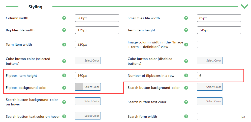
The Flipboxes With Definition template has extra settings.
You can find them under the Glossary Index Page tab → Styling.
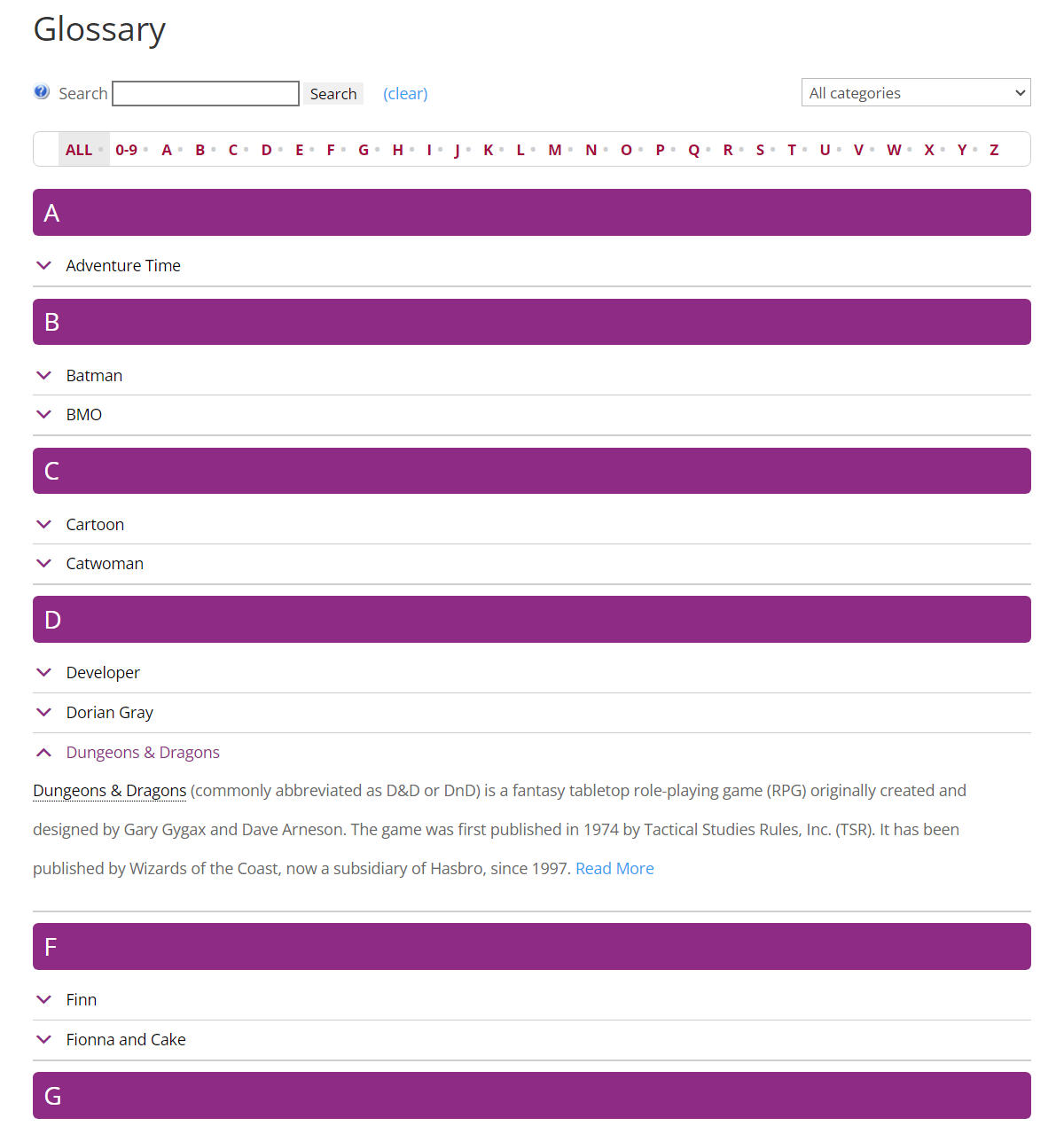
Accordion View
Note: this template was introduced in version 4.3.7 of Pro+ and Ecommerce editions.
[glossary glossary_index_style="accordion-view"]
Extra Settings
The Accordion View template has extra settings.
You can find them under the Styling section:
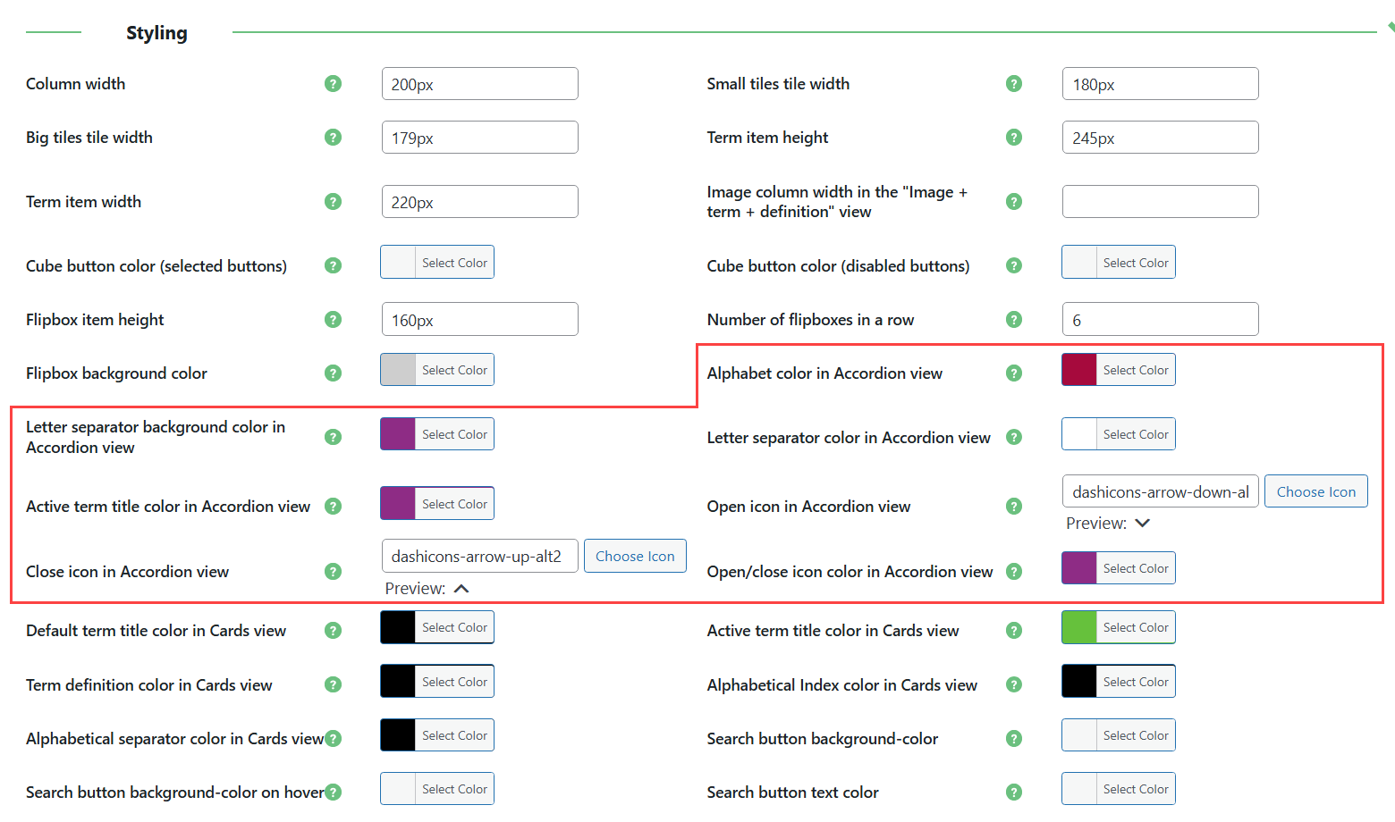
- Alphabet color in Accordion view - Select the color for the alphabet bar.
- Letter separator background color in Accordion view - Select the background color for separator.
- Active term title color in Accordion view - Select the color for the title of the expanded term.
- Letter separator color in Accordion view -Select the color for the letter in the separator.
- Open icon in Accordion view - Select an open icon for the glossary definition. You can choose from the list of dashicons.
- Close icon in Accordion view - Select a close icon for the glossary definition. You can choose from the list of dashicons.
- Open/close icon color in Accordion view -Select the color for open/close icons.
Accordion View 2
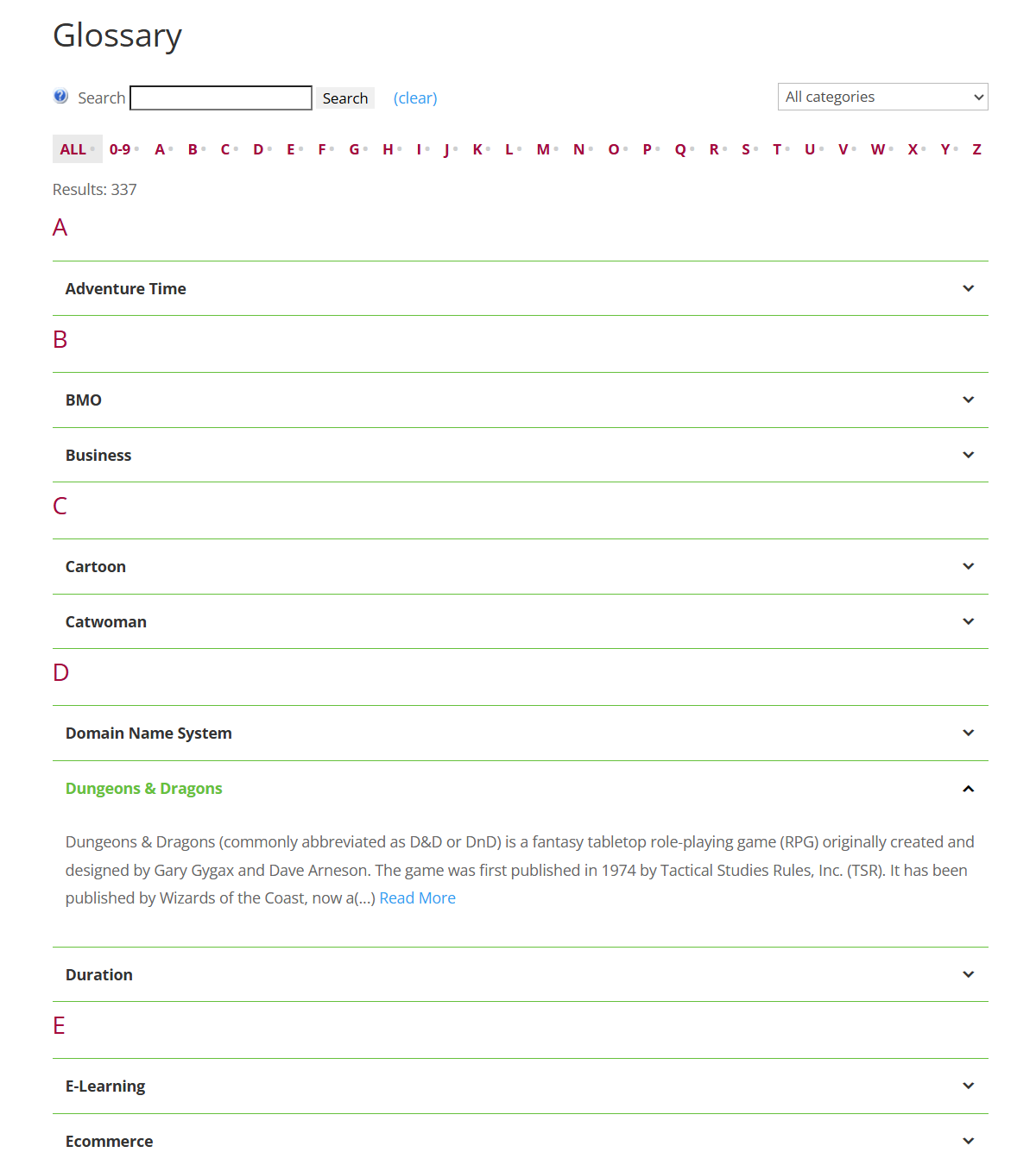
Note: this template was introduced in version 4.4.3 of Pro+ and Ecommerce editions.
[glossary glossary_index_style="accordion-view-2"]
Extra Settings
The Accordion View 2 template has extra settings.
You can find them under the Styling section:
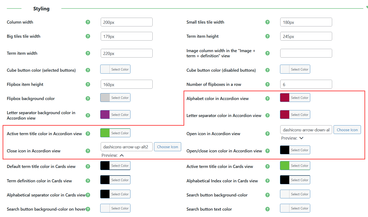
- Alphabet color in Accordion view - Select the color for the alphabet bar.
- Active term title color in Accordion view - Select the color for the title of the expanded term.
- Letter separator color in Accordion view -Select the color for the letter in the separator.
- Open icon in Accordion view - Select an open icon for the glossary definition. You can choose from the list of dashicons.
- Close icon in Accordion view - Select a close icon for the glossary definition. You can choose from the list of dashicons.
- Open/close icon color in Accordion view -Select the color for open/close icons.
Cards View
Note: this template was introduced in version 4.3.9 of Pro+ and Ecommerce editions.
[glossary glossary_index_style="cards-view"]
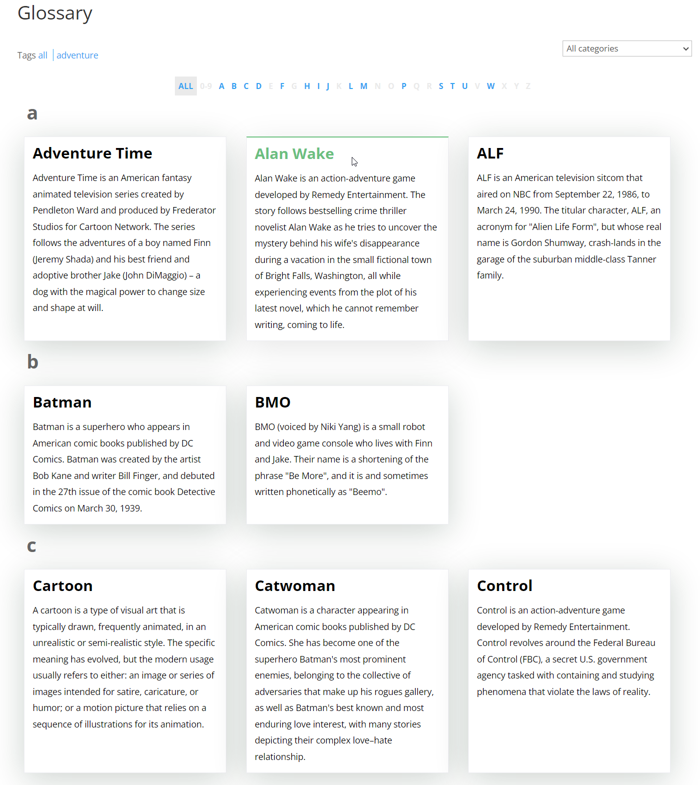
Extra Settings
The Cards View template has extra settings.
You can find them under the Styling section:
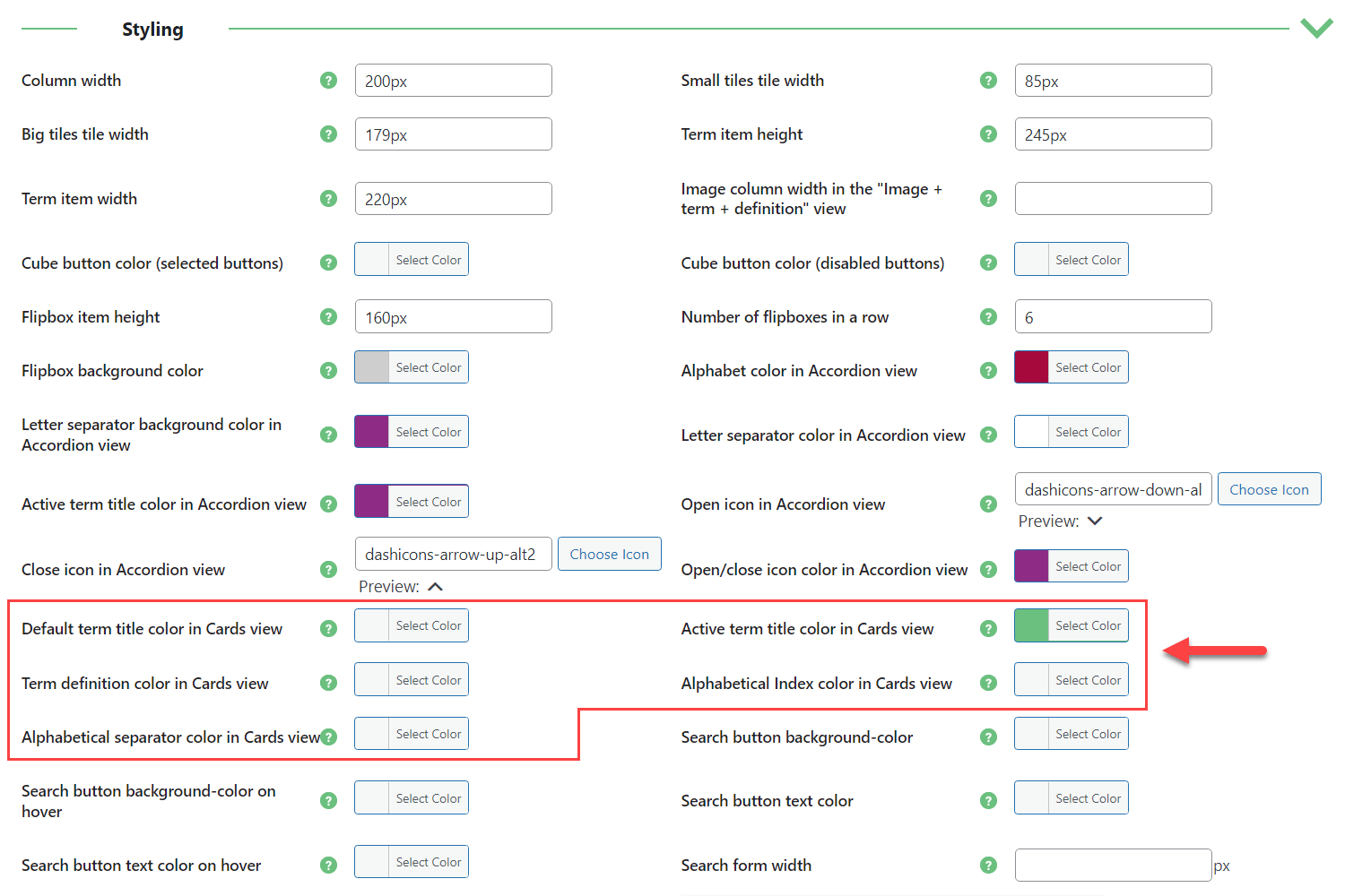
- Default term title color in Cards view - Select the color for the term title displayed in the card.
- Active term title color in Cards view - Select the term title color when you the user hover on the card.
- Term definition color in Cards view - Select the term definition color in the card.
- Alphabetical Index color in Cards view - Select the alphabetical index color in the Cards view.
- Alphabetical separator color in Cards view - Select the alphabetical separator color in the Cards view.
 |
More information about the WordPress Glossary Plugin Other WordPress products can be found at CreativeMinds WordPress Store |
 |
Let us know how we can Improve this Product Documentation Page To open a Support Ticket visit our support center |
