WordPress Glossary Plugin (CMTG) - Use Case - Ways to Style the Tooltip
Use Case - Ways to Style the Tooltip
Note: This guide covers features from:
- WordPress Glossary plugin - This document uses Ecommerce version 4.5.2.
Introduction
The WordPress Glossary plugin allows you to create a site with a complete glossary of terms. Each term definition can appear on mouse hover across the whole site.
The plugin includes lots of settings to allow you to configure the appearance and behavior of tooltips.
Use Case Front-end
Examples of different tooltips styles
Example 1:

Example 2:

Example 3:

Use Case Assumptions
In this example use case guide we will show different ways to style the tooltip. You will learn how to configure the tooltip content, apply animation effects, adjust visual styles, set category-based designs, and use custom CSS for advanced customization.
In this use case guide we are using the Ecommerce version of the plugin - most of the styling settings are also available in Pro and Pro+ versions.
We consider that you have already bought the plugin, but not installed it yet.
It follows:
- Installing the plugin
- Quick recap
- Tooltip settings
- Tooltip content settings
- Tooltip appearance settings
- Tooltip animation settings
- Tooltip styles for categories
- Extra - Custom CSS styling
- End result
Installing the Plugin
The process is the same for all CM plugins and add-ons.
- Download the plugin from your customer dashboard.
- Log in to WordPress and navigate to the WordPress Admin → Plugins settings.
- Click on Add New.
- Activate it and add the license.
Learn more: Getting Started - Installation And First Steps
Quick Recap
In this use case, we will focus only on styling the tooltip. If you want learn more about how to configure the plugin and create your glossary, please, refer to this use case guide:
Tooltip Settings
To find the settings related to tooltips, navigate to Admin Dashboard → CM Tooltip Glossary Ecommerce → Settings → Tooltip tab.

Tooltip Content Settings
Let's start with how you can manage the definition structure inside the tooltip and control its behavior. The settings are located under the Tooltip - Content section.

The tooltip content settings can be divided into three main groups: behavior, content structure, and text cleanup. Let’s go over each group in detail.
Tooltip Behavior
The options related to the tooltip behavior are:

- Show tooltip - Enable this option to display tooltips on your site.
- Is clickable - Enabling this option can be useful if your tooltips contain links. If the option is disabled, the tooltip disappears once the user unhovers the term.
- Clicking on tooltip redirects to term - When this option is enabled, clicking anywhere in the tooltip will redirect the user to the term page. This option works only if the option Is clickable is enabled and term pages are enabled on your site.
- Show tooltip for all users - Enable this option if you want to show tooltips for all users.
-
Roles allowed to see tooltips - If the option above is disabled, you can choose specific user roles you want to show tooltips to.
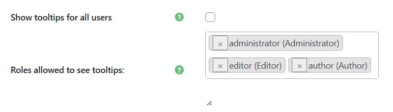
Selecting user roles who can see tooltips
-
- Add term editlink to the tooltip content - If enabled, the tooltip will contain an edit link which is visible only for users with the user capability "edit_posts", such as Admin.
- Open term page link in new tab - If enabled, clicking on the tooltip or "Term details" link will open a term page in a new tab.
- Terms case-sensitive - If enabled, the glossary term will be highlighted and its tooltip will only appear when the term is typed with the exact same capitalization.

Tooltip Structure
The options related to the tooltip structure are:

- Add term title to the tooltip content - Enable this option if you want the term title to be displayed in the tooltip.

- Show link to related articles - Enable this option if you want to show the related articles list in the tooltip.
- How many related articles should be shown - Define the maximum number of related articles in each tooltip. Learn more about related articles.

- How many custom related articles should be shown - Define the maximum number of custom related articles in each tooltip. Learn more about custom related articles.
- Limit tooltip length - This option is useful if you want don't want to show the full term definition, but only a limited number of characters. You can set the maximum number of characters (the minimum value is 30). If set to 0, the limit will be disabled.
- Add term page link to the end of the tooltip content - This option allows you to add a "Term details" link to the term page inside the tooltip. The tooltip has to be clickable for users to be able to click this link. The "Term details" labels can be changed in the plugin labels settings. You can choose between:
- Don't add
- Add only if text is truncated
- Add always

- Add term page link to the end of the term description - Enable this option if you want the term page link to appear after the term description instead of the bottom line of the tooltip. Works only if the Add term page link to the end of the tooltip content option is enabled.

- Symbol indicating the tooltip content has been limited - This option allows you to change the symbol which will be displayed at the end of the truncated term.
- Use term excerpt for hover - Allows to display a term excerpt (if defined) instead of the full definition inside the tooltip.
- Content to be displayed before the Tooltip content - Allows to display pre-defined content before the term definition. This field accepts plain text, HTML and shortcodes.
- Content to be displayed after the Tooltip content - Allows to display pre-defined content after the term definition. This field accepts plain text, HTML and shortcodes. Have a note that this content may not be displayed if you're using the option Limit tooltip length - it might be truncated if the lenght limit is reached.

Tooltip Formatting
The options related to the tooltip formatting are:

- Strip the shortcodes - Enable this option if you want to strip shortcodes from the glossary term description/excerpt before showing the tooltip.
- Remove all tooltip filters - Enable this option if you want to remove all tooltip content filters. This overrides the options below.
- Clean tooltip text - Enable this option if you want to remove extra spaces and special characters from the tooltip text.
- Leave the <a> tags - Enable this option if you want to keep links in the tooltip text (if they're defined in the term definition).
- Leave the <img> tags - Enable this option if you want to keep images in the tooltip text (if the term contains them).
Tooltip Appearance Settings
Next, let's explore the visual styling of tooltips and how you can adjust them to match your site's design.
The settings for that can be found under the Tooltip - Styling section.

Preview
In the bottom-right corner, you can see a preview area that shows in real time how the changes affect the tooltip appearance.

The options in this section are:
- Desktop / Mobile tooltip display method - Select the method of how tooltips should be displayed on desktop and mobile gadgets:
- Default - Displays a tooltip next to the term.
- (new) Box - On the desktop, clicking on a term will display a tooltip next to screen border - either at the bottom, on the left or on the right. On mobile devices, the tooltip will be displayed on the term tap at the bottom of the page.
- Desktop tooltip-box position - Select where you would like to display tooltips on desktop when the method (new) Box is chosen. You can choose between:
- Bottom
- Right
- Left
Note: Learn more about the (new) Box view in this guide: WordPress Glossary Plugin (CMTG) - Tooltips - Alternative Way To Show Tooltips
Example:

- Tooltip font - Set the font of the tooltip. You can disable Google Fonts by selecting "default" - this can be relevant for GDPR compliance. Learn more. Note: this option is available only in eCommerce version of the plugin.
- Show "Close" icon - Enable it to display a "close" icon.
- Show "Close" icon only on mobile devices - Enable it to display a "close" icon. Note: this option works only if Show "Close" icon option is enabled.
- Show stem? - If enabled, the stem will be displayed (works only if in the setting Tooltip placement an option Top/bottom is selected as a tooltip location). Note: this option is available only in Ecommerce version of the plugin.
- Stem color - Set the color of a tooltip stem. Note: this option is available only in Ecommerce version of the plugin.
Example of the stem:

- Close icon color - Set the color of the tooltip close icon.
- Close icon size - Set the size of the tooltip close icon.
- Close icon symbol - Set the symbol for the closed icons. You can use any of the WordPress dashicons. You just need to copy the dashicon slug. Default: 'dashicons-no'. Note: this option is available only in Ecommerce version of the plugin.
- Tooltip background color - Set the color of the tooltip background.
- Tooltip text color - Set the color of the tooltip text.
- Force override all text colors in tooltip? - If enabled, then all of the texts in the tooltip (except for the special text and links) will have their colors overridden by the color from chosen in the option Tooltip text color. Note: this option is available only in Ecommerce version of the plugin.
- Tooltip title's font size - Set the font-size of the term title in the tooltip. Note: works only if the option Add term title to the tooltip content? is enabled.
- Tooltip title's text color - Set the color of the term title in the tooltip. Note: works only if the option Add term title to the tooltip content? is enabled.
- Tooltip title's background color - Set the color of the title's background in the tooltip. Note: works only if the option Add term title to the tooltip content? is set.
- Tooltip title alighn - Choose how to align a term title in the tooltip. Choose between:
- Auto
- Left
- Right
- Center
- Tooltip border - Set border styling (style, width, color).
- Tooltip title's line-height - Set line height of the term title in the tooltip. Works only if the option Add term title to the tooltip content is enabled.
- Tooltip content's line-height - Set line height of the term description in the tooltip.
- Tooltip rounded corners radius - Set rounded corners radius.
- Tooltip opacity - Set opacity of the tooltip (0 is transparent, 100 is fully opaque).
- Tooltip z-index - Set tooltip z-index. Note: Z-index is a CSS property that defines the order of overlapping HTML elements. Increase the value, if the tooltip doesn't appear.
- Tooltip sizing - Set the minimal size of the tooltip in pixels.
- Tooltip placement - Choose the location of the tooltip relative to the term:
- Left/Right
- Top/bottom
- Tooltip positioning - Set the distance of tooltip's bottom left corner from the cursor pointer.
- Tooltip font size - Set the font size inside the tooltip.
- Tooltip padding - Set internal padding: top, right, bottom, left. Note: the Ecommerce version of the plugin has 3 apart options instead of this one:
- Tooltip box padding
- Tooltip title padding
- Tooltip content padding
- Tooltip shadow - Enable this option if you want to show the shadow for the tooltip.
- Tooltip shadow color - Set the color of the shadow of the tooltip.
- Tooltip internal link color - Set the color of the links inside the tooltip.
- Tooltip edit link color - Set the color of the edit links in the tooltip. Note: works only if the option Add term editlink to the tooltip content? is set.
- Tooltip mobile link color - Set the color of the link to the term page in the tooltip. Note: works only if the mobile support is enabled.
Examples of different tooltips styles
Example 1:
Example 2:
Example 3:
Tooltip Animation Settings
Now let's see how you can adjust the animation effects used when tooltips appear and disappear.
These settings can be found under the Tooltip - Animation section.

- Tooltip animation appearance / disappearance time - Set the animation time for tooltip appearance and disappearance. If set to 0, the animation will be disabled.
- Tooltip display / hide animation - Choose the animation for displaying or hiding tooltip.
- No animation
- Fade in / Fade Out
- Grow / Shrink
- Horizontal Flip
- Vertical Flip
- Center Flip
- Rotation
- Horizontal Rotation
- Vertical Rotation
Example of the Center Flip animation:

You can check how other animations look like in this guide: WordPress Glossary Plugin (CMTG) - Tooltips - Display and Hide Animation / Delay
Tooltip Styles For Categories
Note: the Categories features is available in Pro+ and Ecommerce versions only.
The plugin also allows you to customize tooltip styles for different categories, overriding default tooltip style. It lets you give each type of term a distinct look.
To find the category settings, navigate to Admin Dashboard → CM Tooltip Glossary Ecommerce → Categories tab.

On the left side of the screen, you can see a form for creating glossary categories. A few settings are related to tooltip styling:

The options are:

- Disable tooltips - Turn on this option if you want to disable displaying tooltips for terms of a certain category.
- Tooltip background color - Choose custom background color for a tooltip.
- Tooltip width - Set the custom tooltip width for the terms belonging to this category.
- Tooltip height - Set the custom tooltip height for the terms belonging to this category.
- Tooltip text color - Choose custom text color inside of a tooltip.
- Tooltip text font-size - Define the custom size of the text inside of a tooltip.
- Tooltip reset custom styles to default - Turn on this option when editing an existing category and save the changes, if you want to reset custom styles to default (according to global plugin settings).
Examples of different tooltips for terms from different categories.

Extra - Custom CSS Styling
Besides dozens of styling options which you can find in the plugin settings, you can also customize tooltip style using CSS. Learn more about it in this user guide:
End Result
Following instructions found in the plugin and guides, you should be able to customize the tooltip appearance and create a consistent design that fits your WordPress site.
Use Case Front-end
Examples of different tooltips styles
Example 1:
Example 2:
Example 3:
 |
More information about the WordPress Glossary Plugin Other WordPress products can be found at CreativeMinds WordPress Store |
 |
Let us know how we can Improve this Product Documentation Page To open a Support Ticket visit our support center |