WordPress Glossary Plugin (CMTG) - Shortcodes - Glossary Custom Tooltip Shortcode with Dashicons
Glossary Custom Tooltip Shortcode
TIP: What Are Shortcodes
Shortcodes add dynamic content to your site via a small piece of code.
Learn more: Shortcodes - How To Use | Finding ID of Post/Page/Other Content
With the WordPress Glossary plugin, if you want to add a tooltip to some word/phrase/image on a single page but you don't want to or can't add it as a term, you can use the Custom Tooltip Shortcode.
Shortcode: [glossary_tooltip content="text" dashicon="dashicons-editor-help" color="#c0c0c0" size="16px"] term [/glossary_tooltip]
Shortcode Parameters
- Required - Use either content or term_id
- content - The tooltip will display the content specified in the parameter. Useful when the content is not updated constantly.
- Example -
[glossary_tooltip content="This is the text that will be shown"] term [/glossary_tooltip]
- Example -
- term_id - The tooltip will display the content of a certain term, specified by its ID. Userful when the content is updated constantly.
-
Example -
[glossary_tooltip term_id="10000"] term [/glossary_tooltip]TIP: Finding the term ID
Edit the term and check the URL. The ID is located after the "post=" segment, as highlighted.

Term ID
-
- content - The tooltip will display the content specified in the parameter. Useful when the content is not updated constantly.
- Optional
- link - Clicking the parsed word will direct the user to this link.
- underline - The term and dashicon tooltips will not be underlined by default. If you want to force underline you need to set this parameter to 1.
- tsize - Define the size of text inside of the tooltip. Note: this parameter was introduced in version 4.2.0.
- tcolor - Define the text color inside of the tooltip. Note: this parameter was introduced in version 4.2.0.
- bgcolor - Define the background color of the tooltip. Note: this parameter was introduced in version 4.2.0.
- dashicon - The icon which will be used before term to display the tooltip (list of possible dashicons).
- color - The color of the dashicon.
- size - The size of the dashicon.

How To Use
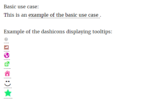
1) Basic use case - the display of a single word or phrase existing in the content of your post/page.
Example:
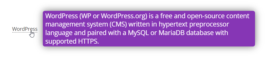
[glossary_tooltip link="cminds.com" tsize="18px" tcolor="#ffffff" bgcolor="#802BB1" underline="1" content="WordPress (WP or WordPress.org) is a free and open-source content management system (CMS) written in hypertext preprocessor language and paired with a MySQL or MariaDB database with supported HTTPS."]WordPress[/glossary_tooltip]
2) Advanced use case - utilizing the support for the dashicons library built in WordPress. This allows you to easily add help/explanations with the eye catching graphic elements instead of plain text:
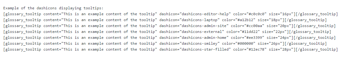
Below: A lot of examples displaying different dashicons with different sizes and colors:
Below: Basic use case shows the Example 1) and later on it displays how the dashicons can look in the text.
 |
More information about the WordPress Glossary Plugin Other WordPress products can be found at CreativeMinds WordPress Store |
 |
Let us know how we can Improve this Product Documentation Page To open a Support Ticket visit our support center |