WordPress Curated Lists (CMCLM) - Options (General, Search Filter, Social, Appearance)
List Options/Settings
To access the WordPress Curated Lists plugin options/settings, go to Options in the plugin dashboard.

1) Plugin Options
In this section, there are several options for formatting and styling the curated lists.
1.1) General Options
In general options, users can:

- Number of columns - Edit the number of columns in the list.
- Items per page - Set max number of links displayed per each page or leave it empty to exclude pagination.
- Favicons display - Enable it to display favicons. Favicons are the icons next to each link.
- Favicons local cache - If this is checked, favicons will be saved locally. This is not recommended for large lists with many favicons, as it can cause performance issues.
- No follow - Add rel="nofollow" to links to instruct search engine bots not to follow links for SEO purposes.
- Open in a new window or tab - Enable links to open in a new window or tab.
- Label for call now button - The label for a button that is displayed for items with phone number instead of URL. Note: this option was introduced in version 1.4.5. Learn more about this feature in this article.
-
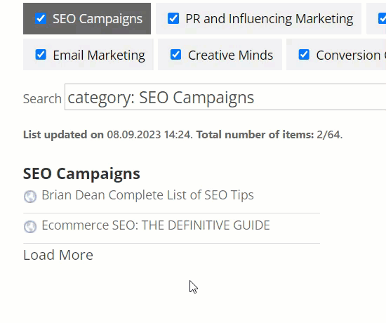
Label for load more link - Define the label for a link "Load More". This link appears when you limit the amount of displayed links per category (using the shortcode parameter max_links - learn more). Clicking on it will load more links of the category. Note: this option was introduced in version 1.5.1.
'Load more' link - Label for email now button - The label for a button that is displayed for items with email address instead of URL. Note: this option was introduced in version 1.4.5. Learn more about this feature in this article.
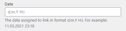
- Event date format - Change the date and time format of the event date. Learn more about date formats in WordPress. Note: this option was introduced in version 1.4.6.
-
Edit/delete link for admin in frontend - if enabled, then edit and delete links will be displayed on front-end and visible only for administrators. Note: this option was introduced in version 1.5.9.
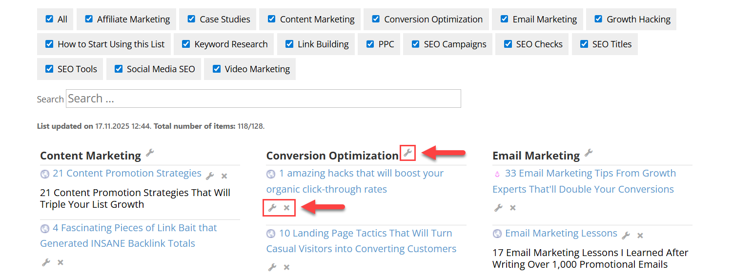
Admin links


1.2) Search and Filter
There are also options for changing the search and filter function. Users can:

- Show search and filter - Disable/enable showing a list search bar and category tabs for filtering.
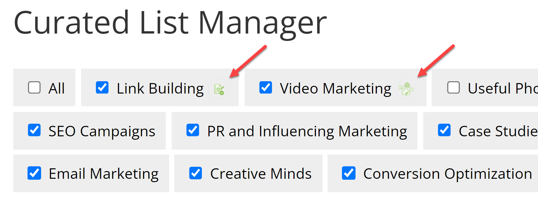
- Allow user to hide/show categories filter - Disable/enable allows user to hide some categories in categories filter.
- Show additional information - Disable/enable showing additional information below the search field.
-
Show category image - Enable it to display category images. Note: this option was introduced in version 1.5.1.
Category image - Additional information position - Choose where to show additional information:
- Below the search field
- Below the links
- Filters position - Choose where to display the filters:
- Top - Above the curated list.
- Left - On the left side of the curated list.
-
Right - On the right side of the curated list.
Note: this option was introduced in version 1.5.9.

Labels In the Category Filter
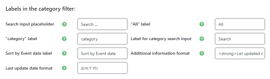
Here it's possible to adjust the labels for:
- Labels in the category filter:
- Search input placeholder
- "All" label
- "category" label in the search input
- Label for category search input - Search input label. Leave it blank to remove label
- Sort by Event date label
Additional information
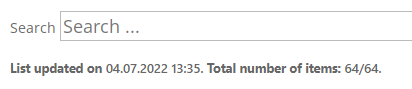
- Additional information format - Edit what information is shown under the search field using placeholders such as {last-update-date} (display list latest update), {links-count} (total number of links), and using HTML entities for formatting.
- Last update date format - Change the date format for the label "List updated on...". Learn more about date formats in WordPress. Note: this feature was introduced in version 1.4.6.
Here's an example of how using the update date and list count placeholders looks:
Plugin users can also ascribe a tag for new content added or edited within a specific time frame. To do this, the tag must already be created in Tags. Then, select the tag to label new entries from the drop-down. To disable this feature, simply leave the dropdown empty.
1.3) Links
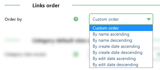
- Name ascending
- Name descending
- Create date ascending
- Create date descending
- Edit date ascending
- Edit date descending
1.4) Category
Choose who can view category by default. Choose from:
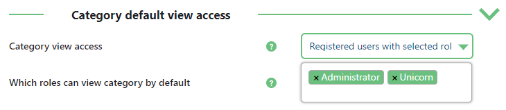
- All users
- Logged-in users only
- Registered users with selected roles
- Personal (category author) access only
TIP: Individual Category Access
You can set different view access for each category. When editing or creating a category, adjust the Category view access setting.
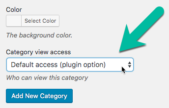
Options:
- All (including logged off visitors)
- Logged-in users
- Registered users of certain roles defined by you
- Category author
- Default access (according to Category default view access)
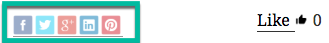
1.5) Social Buttons
Displays the share button for a series of social networks.
Settings:
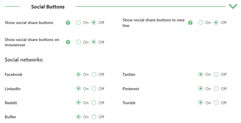
- Show social share buttons - Displays social buttons.
- Show social share buttons in new line - If enabled, social share buttons will be shown in a new line.
- Show social share buttons on mouseover - If enabled, social share buttons chain will be shown on mouse over share icon. If disabled, chain will be shown on click.
- Social networks - Choose between Facebook, Twitter, LinkedIn, Pinterest, Reddit, Tumblr and Buffer.
1.6) Link Voting
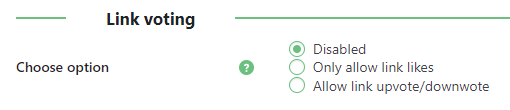
Choose from:
- Disabled - Visitors cannot vote
- Only allow link likes - Allow visitors to like a link
- Allow link upvote/downvote - Allow visitors to like or dislike a link

1.7) "New" Tag
This feature allows you to automatically add tag to new or just edited links for specific time. There is also a dropdown to select how "new" entries must be to have this tag (choose from 1 day to 3 months).
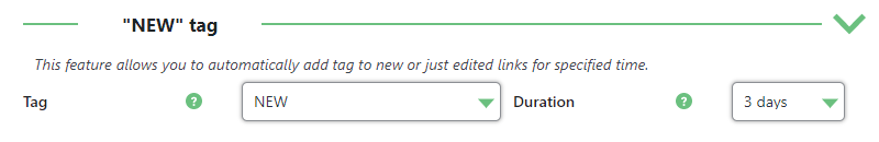
In this example, any entry created or edited within 3 months will have the tag "NEW." To change the tag name or color, go to the Tags section.
1.8) Frontend Submission
Note: this section with options was introduced in version 1.5.9.
This feature allows users to suggest and edit links and categories on the front-end.

- Link add access - Choose which type of users are allowed to submit new links on the front-end:
- Disabled - Disallow submitting new links.
- All users (Logged in and non logged in) - Allow all users to submit new links.
- Logged in users only - Allow only logged-in users to submit new links.
- Registered users with selected roles - Allow only users with selected roles to submit new links. When this option is chosen, a new option appears:
- Which roles can add links from the frontend - Select the user roles that are allowed to submit new links.
- Link edit/delete access - Choose what type of users are allowed to edit existing links on the front-end:
- Disabled - Disallow editing links.
- All users (Logged in and non logged in) - Allow all users to edit links.
- Logged in users only - Allow only logged-in users to edit links.
- Registered users with selected roles - Allow only users with selected roles to edit links. When this option is chosen, a new option appears:
- Which roles can edit/delete links from the frontend - Select the user roles that are allowed to edit links.
- Category add access - Choose what type of users are allowed to add new categories on the front-end:
- Disabled - Disallow adding categories.
- All users (Logged in and non logged in) - Allow all users to add categories.
- Logged in users only - Allow only logged-in users to add categories.
- Registered users with selected roles - Allow only users with selected roles to add categories. When this option is chosen, a new option appears:
- Which roles can add categories from the frontend - Select the user roles that are allowed to add categories.
- Category edit/delete access - Choose what type of users are allowed to edit/delete categories on the front-end:
- Disabled - Disallow editing/deleting categories.
- All users (Logged in and non logged in) - Allow all users to edit/delete categories.
- Logged in users only - Allow only logged-in users to edit/delete categories.
- Registered users with selected roles - Allow only users with selected roles to edit/delete categories. When this option is chosen, a new option appears:
- Which roles can edit/delete categories from the frontend - Select the user roles that are allowed to edit/delete categories.
- Moderation - If enabled, all suggested or edited links and categories will be held for admin moderation.
- Captcha - If enabled, a simple captcha will be added to the submission form to prevent spam link and category submissions.
Manage Link Form Labels
- Form heading
- Form heading for edit
- Name field text
- Subtitle field text
- Description field text
- URL field text
- Captcha field placeholder text
- Submit button text
- Update button text
- Delete button text
- Delete button confirm text
- Captcha failure error
- Link failure text
- Link success text
- Form update success text
- Form success text for moderation
- Form update success text for moderation
- Form delete success text
Manage Category Form Labels
- New category button label
- Form heading
- Form heading for edit
- Name field text
- Description field text
- Captcha field placeholder text
- Submit button text
- Update button text
- Delete button text
- Delete button confirm text
- Captcha failure text
- Category failure text
- Category success text
- Category update success text
- Category success text for moderation
- Category update success text for moderation
- Category delete success text
Notifications
- Notification in the admin dashboard - Enable it to display a notification in the admin dashboard, when link and category submissions are waiting for approval.

- Waiting links reminder email - Enable it to send email notifications, when link and category submissions are waiting for approval.
- Reminder interval (Days) - Set how often email notifications should be sent. The period value is specified in days.
- Recipient Email Addresses - Define one or multiple email addresses, where to send email notifications. Multiple emails should be separated with comma.
- Reminder email subject - Set the subject of the email notification.
- Reminder email content - Set the body of the email notification. Use placeholders {waiting_links_count} and {waiting_links_count} to display the number of links and categories respectively waiting for approval.
TIP
2) Plugin Appearance
In the plugin appearance tab, users can change settings related to category, link, and tooltip appearance.
2.1) Categories
In the general categories appearance section, users can change:

- Font size - Category name font size (leave empty for default font size)
- Text color - Category name text color (leave empty for default)
- Background color - General category background color (individual category background colors can be edited in Categories)
-
Use the category color as a filter color - If enabled, the category filters will be the same colors as the relevant category backgrounds. Note: this option was introduced in version 1.5.9.
Using category colors as filter colors -
Show category image - Enable it to display category images under the category titles. Note: this option was introduced in version 1.5.1.

Category image example - Category image width - Define the width of the category image in px format. Leave empty to auto size the image width. Note: this option was introduced in version 1.5.1.
- Category image height - Define the height of the category image in px format. Leave empty to auto size the image height . Note: this option was introduced in version 1.5.1.


2.2) Links
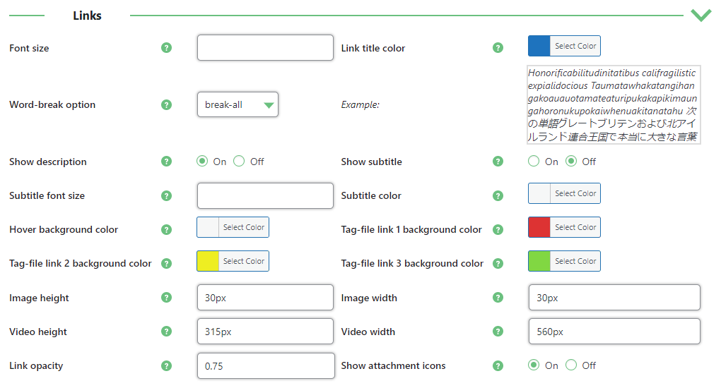
- Font size - Individual link entry font size (leave empty for default)
- Word-break option - Determine how word wraps will be applied in the link title. Available options are:
- break-all;
- break-word;
- keep-all;
- normal;
- Find out more about word-break at developer.mozila
- Link title color - Leave empty for default
-
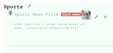
Show description - Enable this option to display description under the link (if the link has description). Note: this feature was introduced in version 1.3.4.

Link description example - Subtitle font size - Leave empty for default
- Subtitle color - Leave empty for default
-
Hover background color - This is the color that appears when a user hovers over the link entry. The default means no color change. For example, this is what the list looks like with a red hover background color:

Hover background color example -
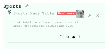
Tag-file links background color - Choose the color of the additional links you can include inside each link

Tag-file links background color example - Image height - Height of images in links (vertical - leave empty for auto size)
- Image width - Width of images in links (horizontal - leave empty for auto size)
- Video height - Height of videos in links (vertical - leave empty for auto size)
- Video width - Width of videos in links (horizontal - leave empty for auto size)
- Link opacity - Opacity of the link. Leave empty for default.
- Show attachment icons - Show file-type icon of attached files.


2.3) Tiles View
Note: this section with options was introduced in version 1.5.9.
This feature allows to present a list of links as tiles.

To see the full list of available options, enable the option Display links as tiles.

Once it's enabled, the following options appear and allow you to configure the tiles view:

- Border style - Choose the tile border style (e.g., solid, dashed, etc.).
- Border width - Set the border width. Use any valid CSS unit (e.g., px, em, rem).
- Border color - Set the border color.
- Corner radius - Set the corner radius for the tile. Use any valid CSS unit (e.g., px, em, rem).
- Padding between tiles - Set the spacing between tiles. Use any valid CSS unit (e.g., px, em, rem).
- Padding inside tiles - Set the internal padding of each tile. Use any valid CSS unit (e.g., px, em, rem).
- Shadow effect - Enable to display a shadow around each tile.
- Hover effect - Enable to display a hover effect when the user points at a tile.
2.4) Tooltips
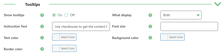
- Show tooltips - Show tooltips on category filter. Learn more about it.
- What display - Choose what to show in the tooltip:
- Both - Show a category description and instruction text after.
- Instruction text - Show the instruction text about how to use category filters. Text of the instruction can be changed in the option below.
-
Category description - Show the description of a category.
Note: this option was introduced in version 1.4.4.
- Text - Change the text of the instruction in a tooltip. Note: this option was introduced in version 1.4.3.
- Font size - Font size of tooltips. Leave empty for default.
- Text color - Text color of tooltips. Leave empty for default.
- Background color - This is the tooltip description shown when the reader hovers over a link.
- Border color - Border color of tooltips. Leave empty for default.
2.5) Social networks Buttons
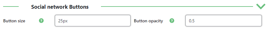
- Button size - Size of the network buttons.
- Button opacity - Opacity on the network buttons.
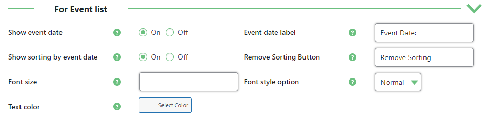
2.5) For Event list
The following options were introduced in the version 1.3.1. These options will work for the links with the set dates.
Learn more about creating the links: WordPress Curated Lists (CMCLM) - Set Up - Adding Link Entries
The options are:
-
Show event date - Enable this option to display the date of adding the event.

Event date example -
Event date label - Change the label for the event date. Note: this label was introduced in version 1.4.6.

Event date label -
Show sorting by event date - Enable this option to allow users sort events by the date.

Allowing to sort by event date -
Remove Sorting Button - Change the label for the "Remove Sorting" button.

- Font size - Change the font size for the event date. Leave empty to use default.
- Font style option - Change the font style for the event date. You can choose between normal and italic.
-
Text color - Change the color of the text for the event date.
Example: Font size - 20px, Font style - italic, Text Color - red.

Changing text color


3) Diagnostic
Note: the tab with the following options was introduced in version 1.4.6.
It is possible to automatically and manually check the 404 links that don't work anymore. Navigate to the tab Diagnostic. The options are:
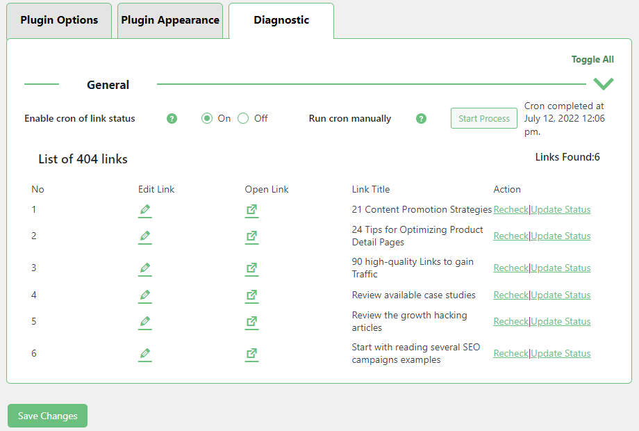
-
Enable cron of link status - Turn on this option if you want to automatically update the statuses of your links list. By default, checking the links will be done once a day. The 404 links will be automatically added to the list below, and the links that work again will be removed from the list.
TIP: Managing the Cron Event
If the option is enabled, you can find the cron event called cmlm_check_link_status_cron using third-party plugin for managing cron events. You can check the time when it's planned.

Cron event example You can also change how often the event should be committed.

Editing cron event - Run cron manually - Click the button Start Process to start the cron process immediately. This option can be used in two cases:
- To run the cron process immediately in case if you don't want to wait when the scheduled cron process will be committed automatically.
-
To run the cron process manually in case if the option Enable cron of link status is disabled.
After clicking the button, you will see the date of last check.
- List of 404 links - Here you can see the list of your 404 links. Here you can:
- Edit Link - Click it to edit the relevant link.
- Open Link - Click it to open the relevant link.
- Recheck - Click it to check the link status. The link status will be automatically changed, if it works again.
- Update Status - Click it to manually change the link status. The link will be marked as the working one.


 |
More information about the WordPress Curated Lists plugin Other WordPress products can be found at CreativeMinds WordPress Store |
 |
Let us know how we can Improve this Product Documentation Page To open a Support Ticket visit our support center |