WP Popup Plugin (CMP) - Use Case - Create Visually Enhanced Popups With Advanced Visual Settings
Use Case - Create Visually Enhanced Popups With Advanced Visual Settings
Note: This guide covers features from the Pro version of WP Popup Plugin - This document uses version 1.7.2.
Introduction
This WP Popup Plugin allows you to display customizable popup banners on your WordPress site. Starting from version 1.7.0, the plugin includes a redesigned Advanced Visual tab, which introduces powerful styling and behavior options to control how the popup appears and looks.
In this use case, we’ll demonstrate how to build a visually enhanced popup.
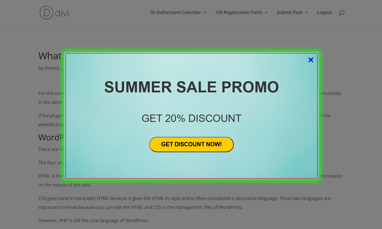
Use Case Front-End
Example of the popup banner:
Use Case Assumptions
In this example use case guide, we’ll demonstrate how to build a visually enhanced popup using the options available in the Advanced Visual tab. We consider that you have already bought the plugin, but not installed it.
It follows:
- Installing the plugin
- Quick recap
- Creating a popup campaign
- Accessing the advanced visual settings
- End result
Installing the Plugin
The process is the same for all CM plugins.
- Download the plugin from your customer dashboard.
- Log in to WordPress and navigate to the WordPress Admin → Plugins settings.
- Click on Add New.
- Activate it and add the license.
Learn more: Getting Started - Plugin Overview
Quick Recap
In this use case we will focus on how to configure advanced visual settings of the popup banner. To learn more about the basic process of creating popups, please check this use case guide:
Creating a Popup Campaign
To create a new popup campaign, go to Admin Dashboard → CM Pop-Up Banners Pro → Add New Campaign.

We will start with some basic visual configuration.
First, let’s add a title and set up the banner content.
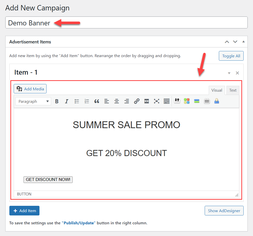
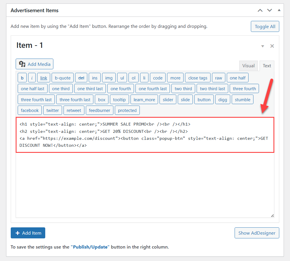
In this example, we’ll use simple text with different heading levels, and add a button with a link. The popup builder supports editing content using HTML editor:
Below, in the metabox Campaign - Options, navigate to the section Basic Visual. Here we will configure the following basic settings:
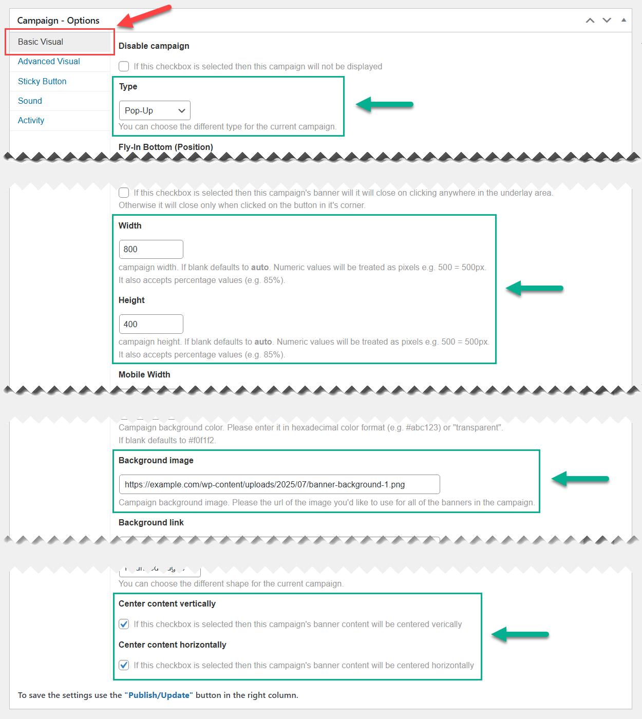
- Type - Here we can choose the popup type. For our use case we will keep the default one - "Pop-up".
- Width / Height - Here we define the size of our popup banner.
- Background image - Here we define the background image, by adding a link to the image from our media-library, which uploaded in advance.
- Center content vertically / horizontally - We select both checkboxes to center the content which we added for our popup.
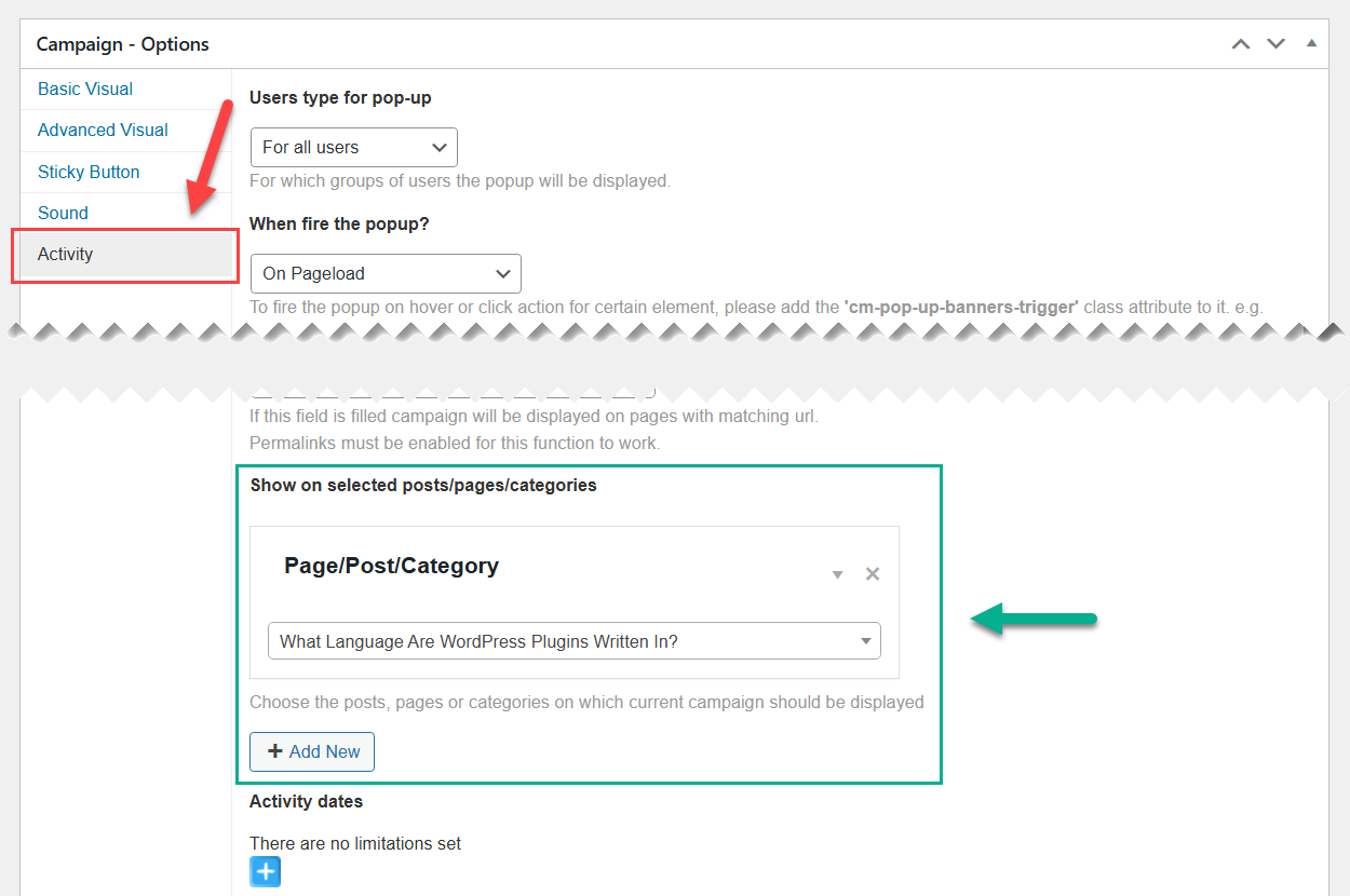
Now let's define where the popup will be displayed. To do this, head to the section Activity and choose needed post or page in the option Show on selected posts/pages/categories.
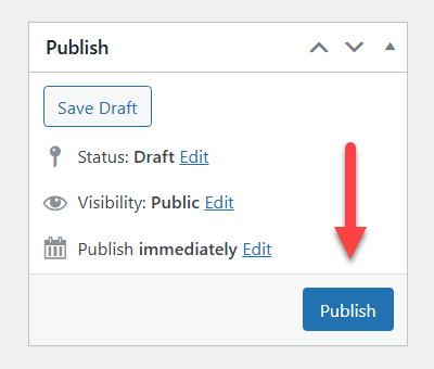
The metabox Publish allows you to create the popup campaign or save the changes.
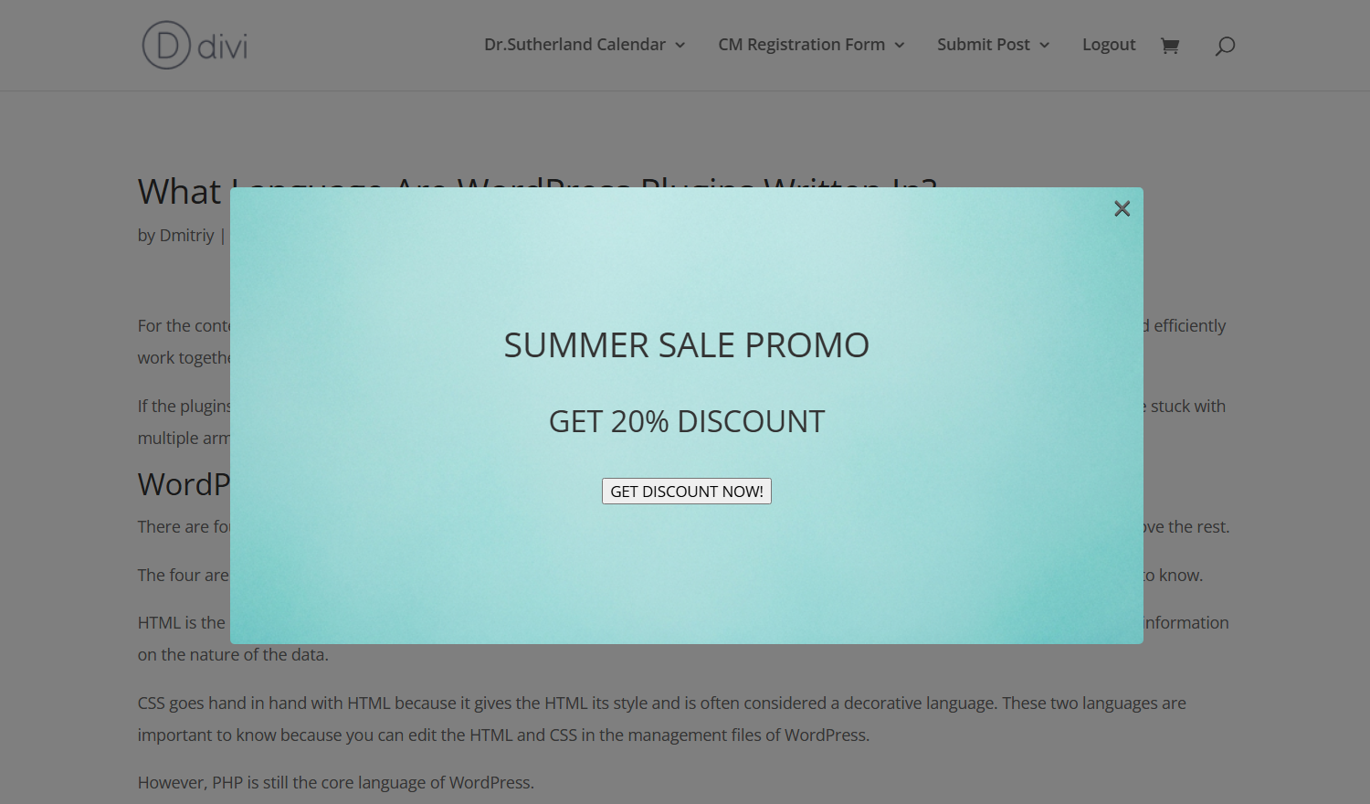
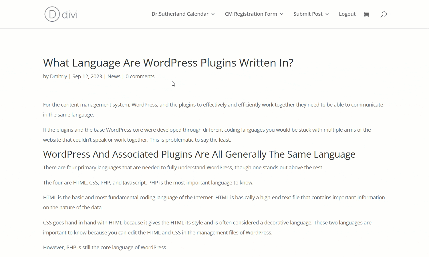
Front-end Result
Here's how our banner currently looks like on the front-end:
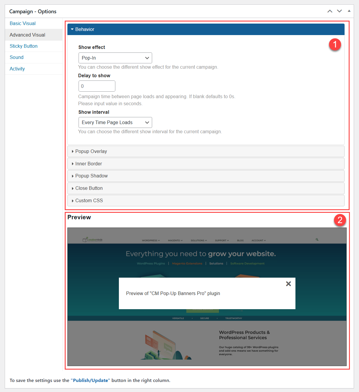
Accessing the Advanced Visual Settings
Now after we configured the basic settings, we can move to the Advanced Visual settings.
Navigate to the section Advanced Visual.
This section is divided into two areas:
- Option panels for configuring visual and behavior settings.
- The Preview area, which shows you how chosen effects will look like on the front-end.
Adding Custom CSS
Let's start with the adding some custom CSS to improve the visual of the content inside our popup banner, which is looking quite simple now. So let's expand the section Custom CSS and insert our code:
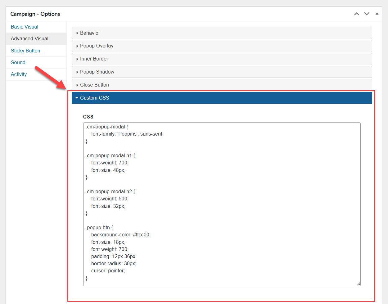
Below is our CSS snippet - it changes the font family, heading sizes, and enhances the button’s visual appearance:
.cm-popup-modal {
    font-family: 'Poppins', sans-serif;
}

.cm-popup-modal h1 {
    font-weight: 700;
    font-size: 48px;
}

.cm-popup-modal h2 {
    font-weight: 500;
    font-size: 32px;
}

.popup-btn {
    background-color: #ffcc00;
    font-size: 18px;
    font-weight: 700;
    padding: 12px 36px;
    border-radius: 30px;
    cursor: pointer;
}
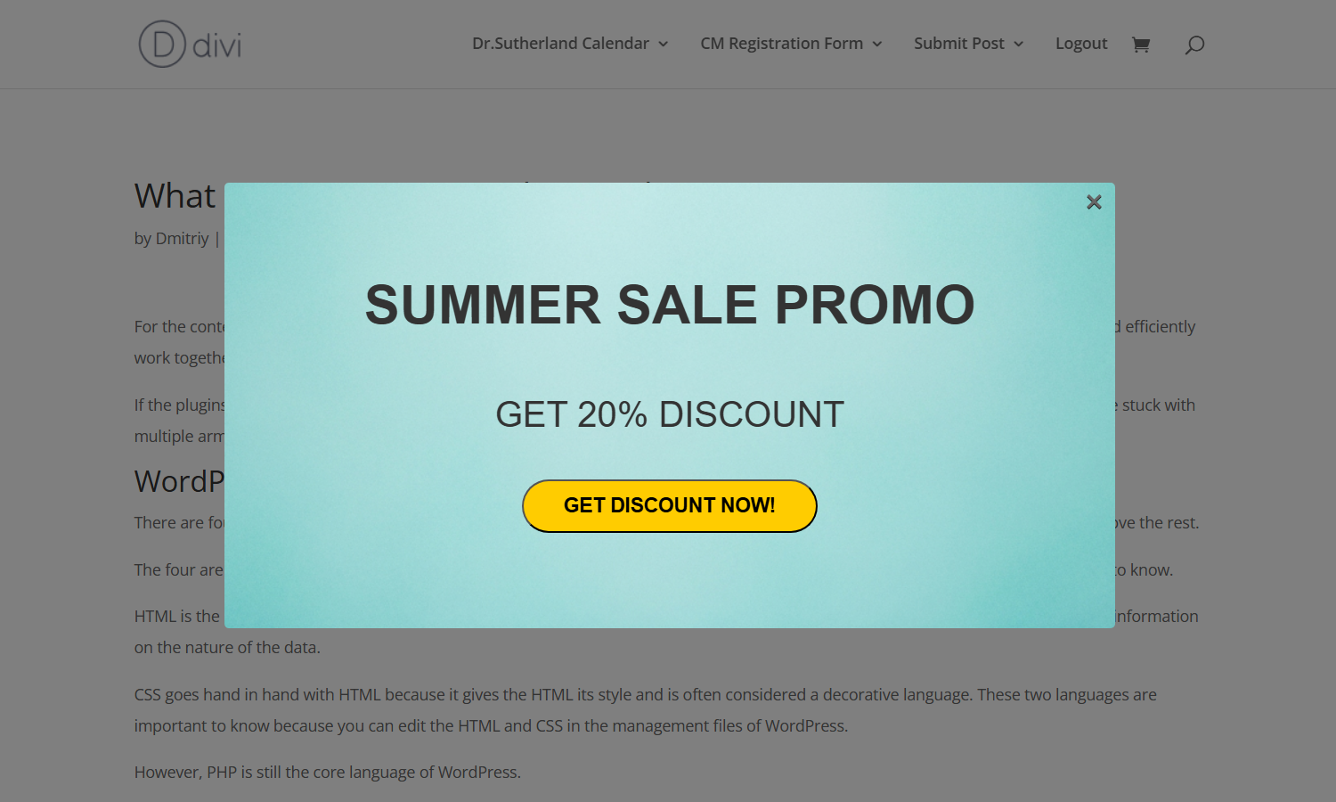
Front-end Result
Here's how our banner looks like now:
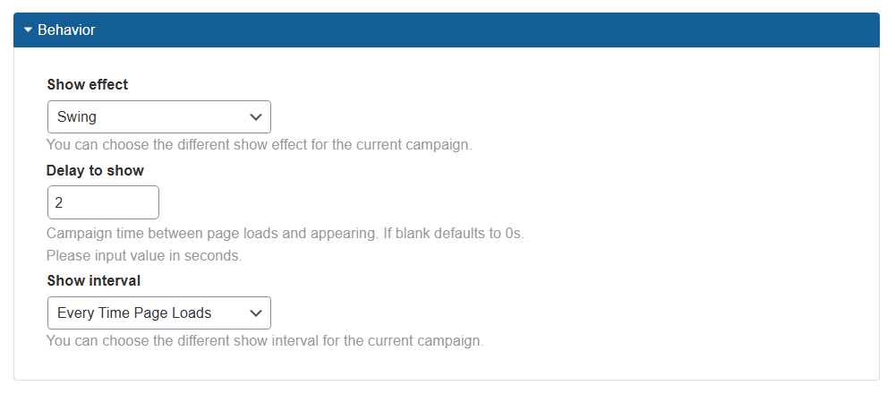
Configuring Popup Behavior
Now let's move to other sections of the Advanced Visual tab. The Behavior section controls how the popup appears and how often it's shown. The options are:
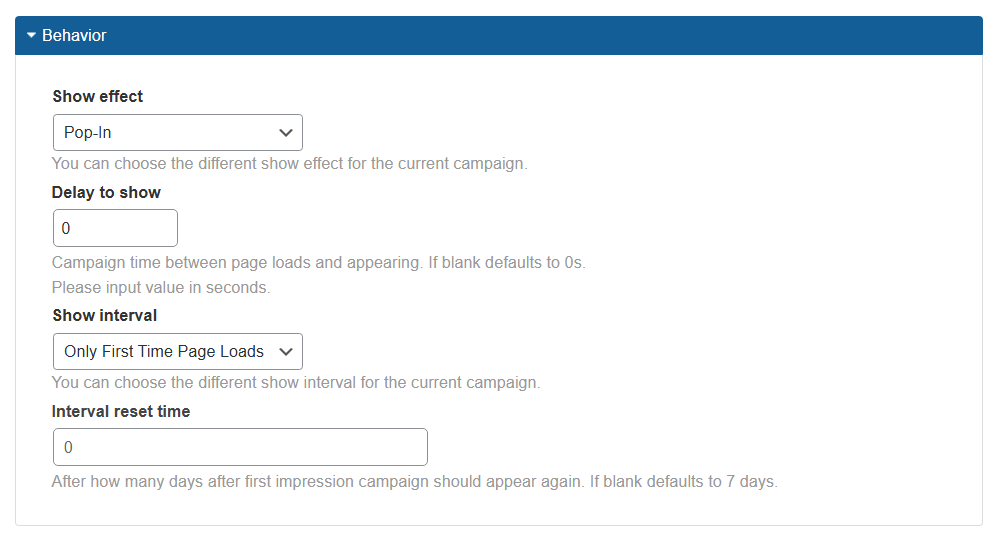
- Show effect - Choose an animation effect for the popup (e.g., "Bounce", "Shake", etc.).
- Delay to show - Define the delay (in seconds) before the popup appears after the page loads.
- Show interval - Decide how often the popup will show per user. Available options:
- Every Time Page Loads - Shows every time the user loads a page.
- Only First Time Page Loads - Shows once per page for each user.
- Once on Any Page - Shows only once, regardless of how many pages include it.
- Fixed number of times till reset - Shows a defined number of times, then hides until the reset period ends.
-
Interval reset time - This option is shown only when relevant interval types are chosen: Only First Time Page Loads and Fixed number of times till reset. Define after how many days the popup should reappear. If left blank, defaults to 7 days.

Configuring show interval
Example configuration:
- Show effect - Swing.
- Delay to show - 2 seconds.
- Show interval - Every Time Page Loads.
Front-end Result
This setup ensures the popup appears in 2 seconds after the page loads with a show effect "Swing". The popup should appear each time the page loads.
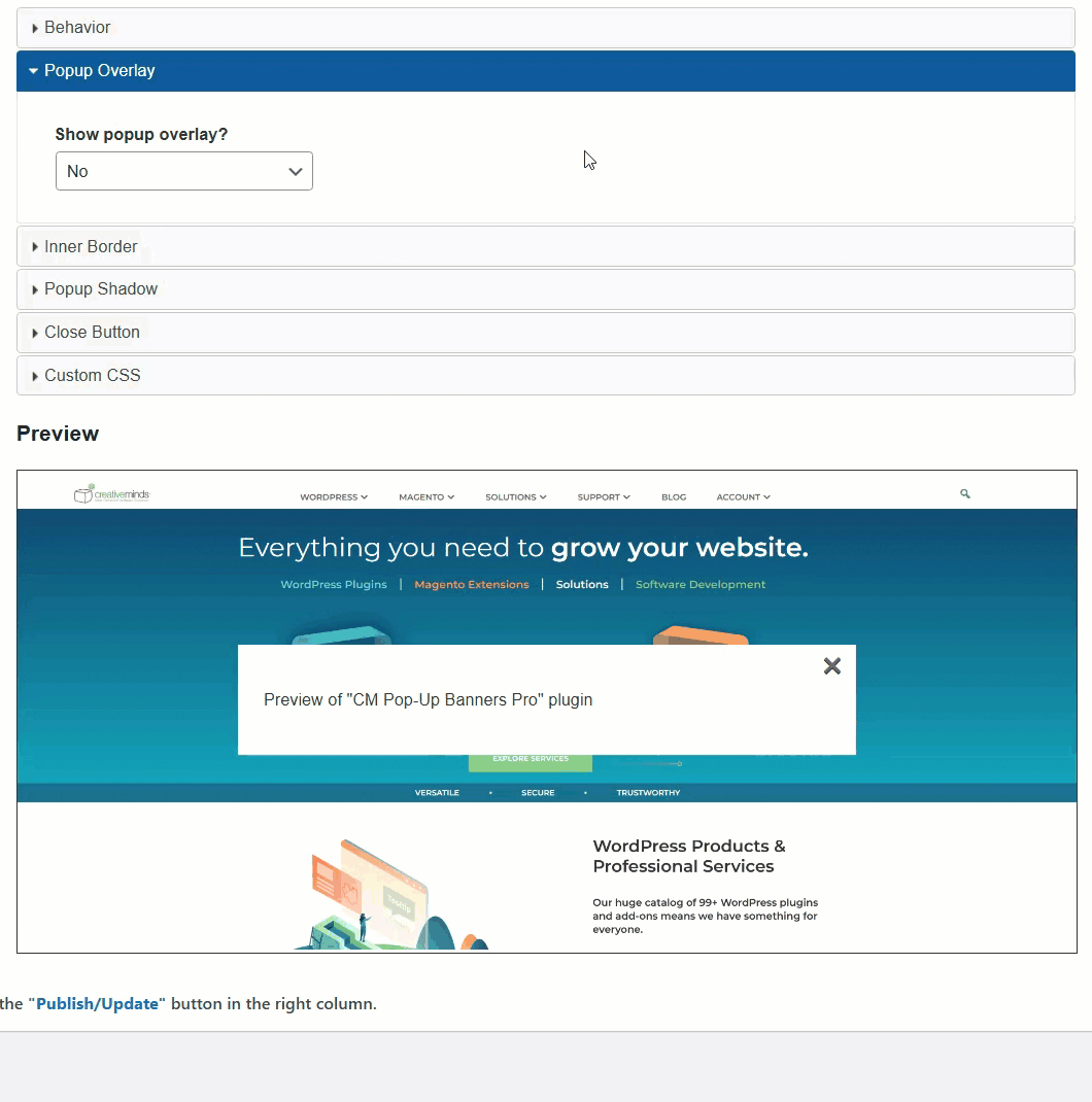
Adding a Popup Overlay
The Popup Overlay section lets you darken or blur the background behind the popup. The available settings depend on which option you choose:
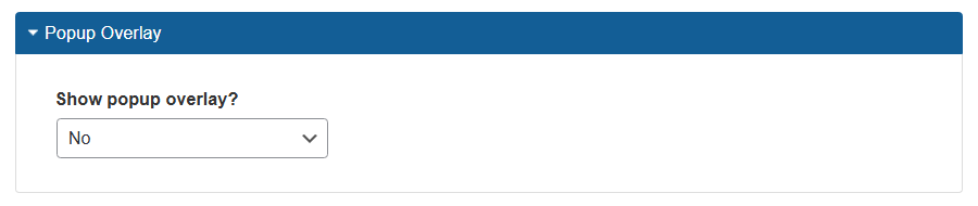
- Show popup overlay - Select how the overlay appears:
- No - No background overlay.
-
Yes (Blur overlay) - Adds a blurred background; set the intensity below in the option Overlay Blur below.

Setting up blur overlay -
Yes (Color overlay) - Adds a solid color overlay; define color and transparency in the options Overlay Color and Transparency below.

Setting up color overlay
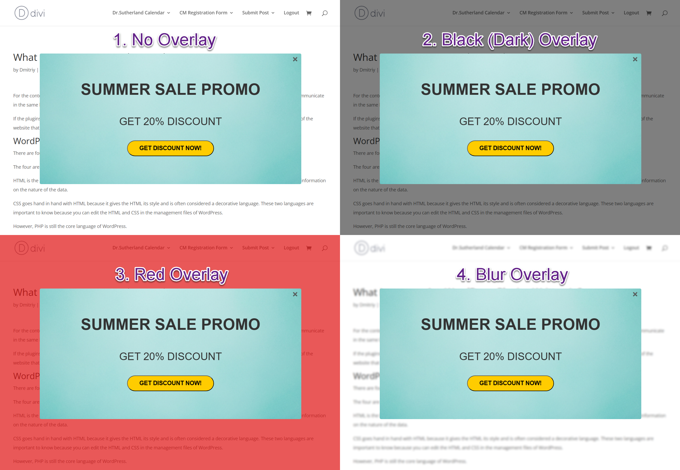
Front-end Examples
Here're a few example of different overlays:
- No overlay.
- Color overlay with black color and transparency value "0.5".
- Color overlay with red color and transparency value "0.7".
- Blur overlay with the "3" degree of blur.
Styling the Inner Border
The Inner Border section allows adding a styled border around the popup content. The options are:
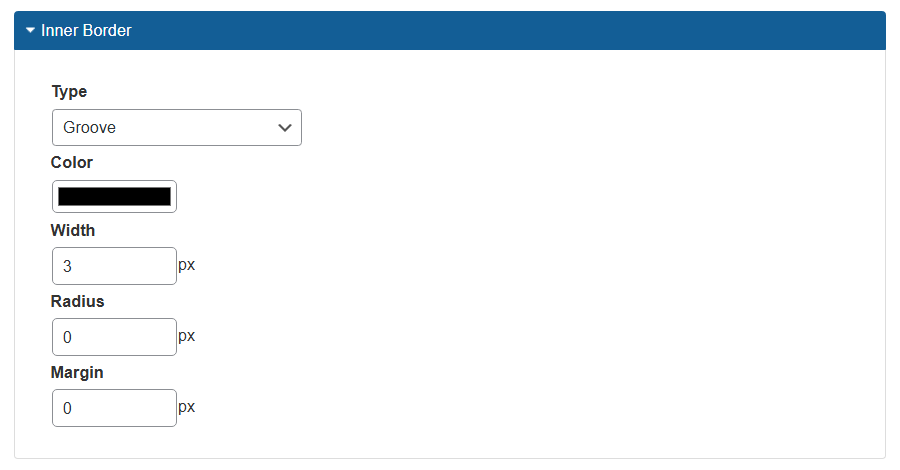
- Type - Select border type (e.g., "Solid", "Dashed", etc. or "None" to disable).
- Color - Define the border color.
- Width - Set border thickness (in pixels).
- Radius - Set corner roundness (in pixels).
- Margin - Add space from the external border of the popup.
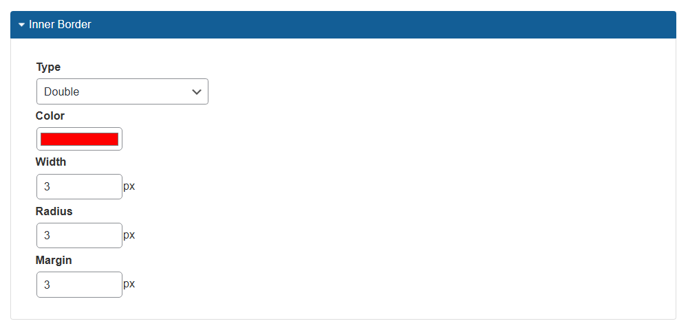
Example configuration:
- Type → Double.
- Color → Red.
- Width → 3.
- Radius → 3.
- Margin → 3.
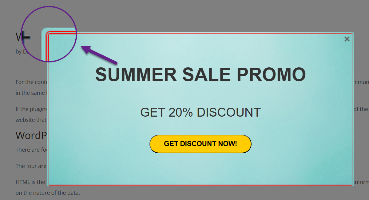
Front-end Result
This creates a red double border with smooth corners and spacing.
Adding a Popup Shadow
The Popup Shadow section gives your popup a visual depth effect. The options are:
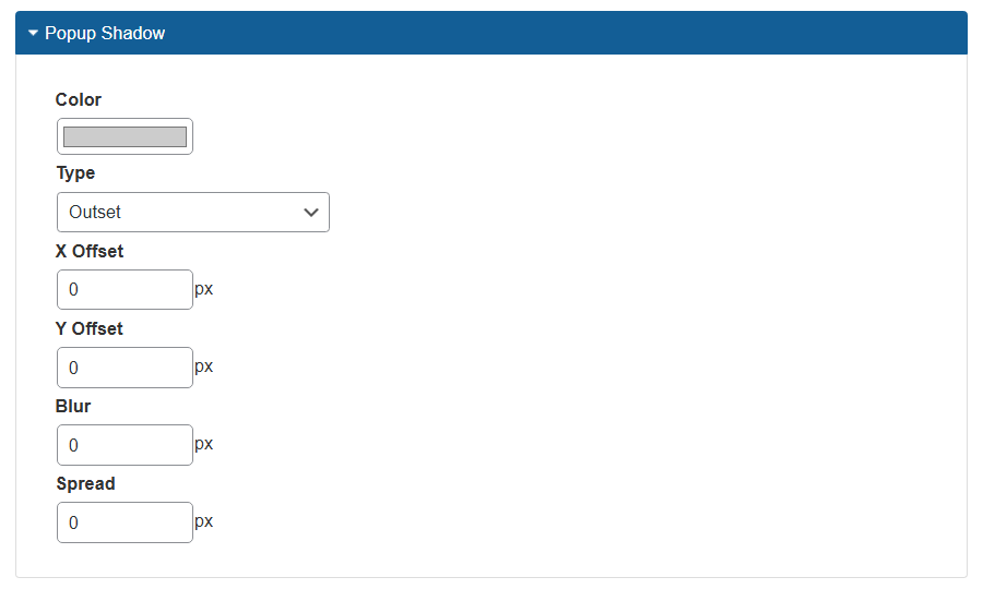
- Color - Set the shadow color.
- Type - Choose:
- None - No shadow.
- Inset - Shadow appears inside the element.
- Outset - Shadow appears outside the element.
- X Offset - Horizontal shift of the shadow.
- Y Offset - Vertical shift.
- Blur - Controls how soft the shadow appears.
- Spread - Controls the size of the shadow.
Example configuration:
- Type → Outset.
- Color → Green.
- X Offset → 0.
- Y Offset → 0.
- Blur → 15.
- Spread → 5.
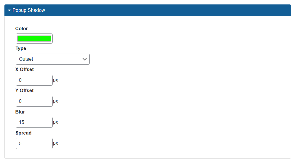
Front-end Result
This results in a soft, green glow behind the popup.

Configuring the Close Button
The Close Button section lets you change the style and location of the button that closes the popup. The options are:
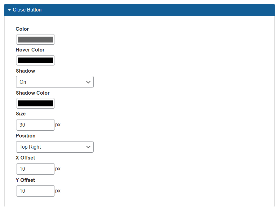
- Color - Set the button’s normal color.
- Hover Color - Set the button color on hover.
- Shadow - Enable or disable a shadow for the button.
- Shadow Color - Define the shadow color.
- Size - Set button size (in pixels).
- Position - Choose one of four corners for placement.
- X Offset - Horizontal position from the corner.
- Y Offset - Vertical position from the corner.
Example configuration:
- Color → Blue.
- Hover Color → Red.
- Shadow → Enabled.
- Shadow Color → Black.
- Size → 35.
- Position → Top Left.
- X Offset → 15.
- Y Offset → 15.
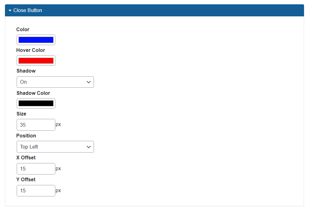
Front-end Result
This places a bigger blue close button in the top-left corner with hover and shadow effects, and with additional margin.
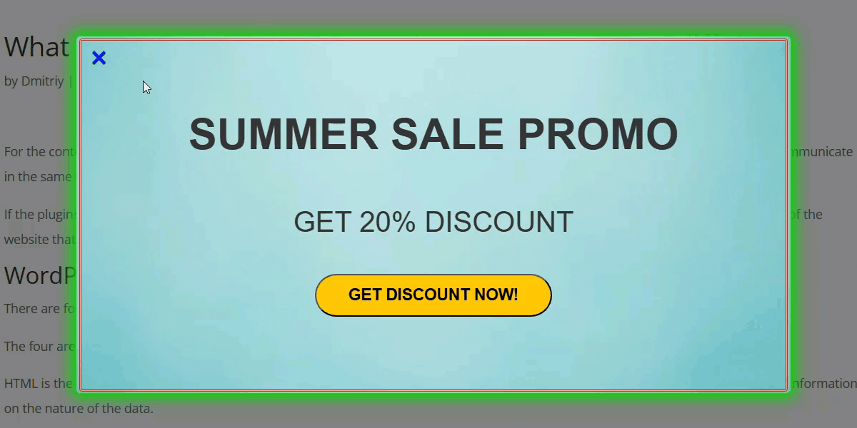
Live Preview and Adjustments
Below you can see the Preview section that shows you how the settings affect the front-end result. It is related only to the following sections:
- Popup Overlay
- Inner Border
- Popup Shadow
- Close Button
Example
This lets you experiment with visual settings before saving the campaign.
End Result
Following instructions found in the plugin and guides, you should be able to build a visually enhanced popup using the options available in the Advanced Visual tab.
Use Case Front-End
Example of the popup banner:
 |
More information about the WP Popup Plugin Other WordPress products can be found at CreativeMinds WordPress Store |
 |
Let us know how we can Improve this Product Documentation Page To open a Support Ticket visit our support center |