WP Popup Plugin (CMP) - Adding/Editing Campaign
Add New Campaign
Navigate to the Admin Dashboard → CM Pop-Up Banners Pro → Add New Campaign.
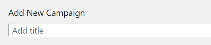
Enter a title for the new campaign in the provided box. The title will not be shown on the popup itself but will help you identify the popup campaign in the plugin statistic panel.
In the Advertisement Items box, enter the content for the popup campaign in the box, as well as other media, links, etc.
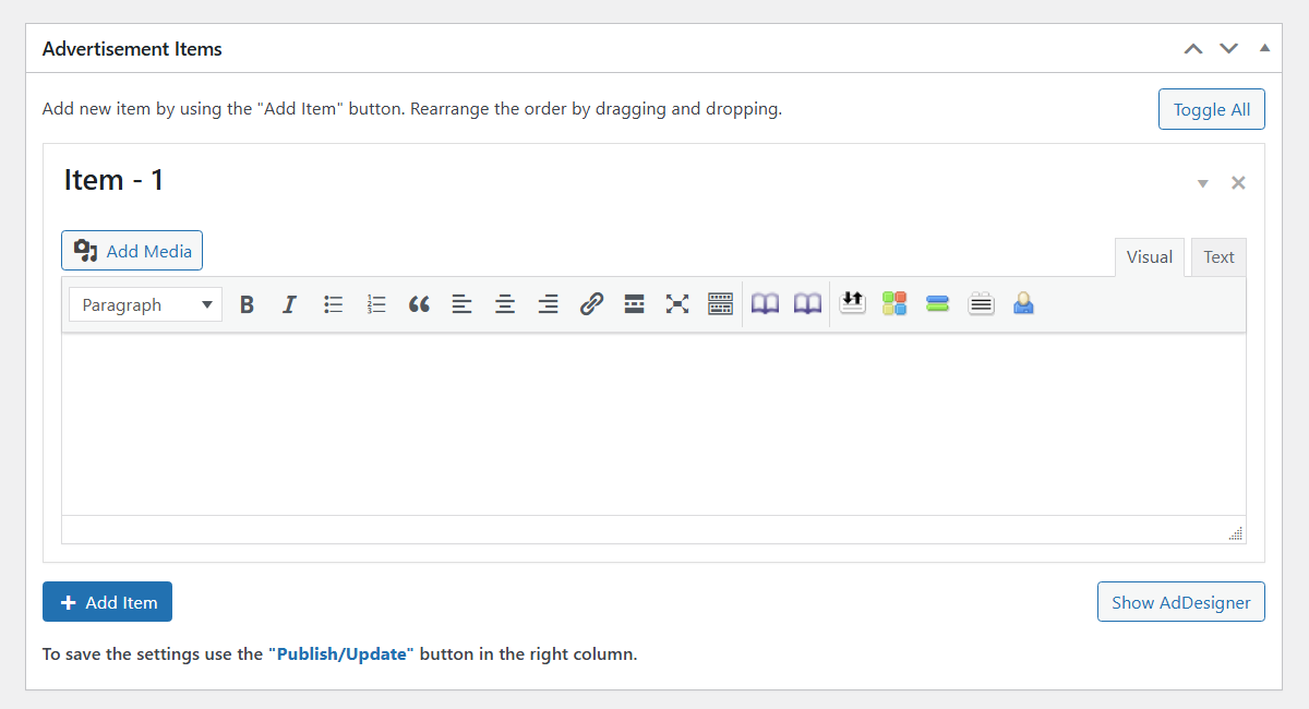
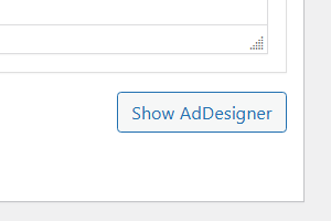
Underneath the box, click on the Add Item button to add the new popup banner. This is used in cases where you want to have a random popup to show up or once you have a new and old copy you want to choose between. Click Show AdDesigner to use a visual designer for the popup banners. Learn more about how to work with AdDesigner.
Banner Types
The WP Popup Plugin has 3 types of popups:
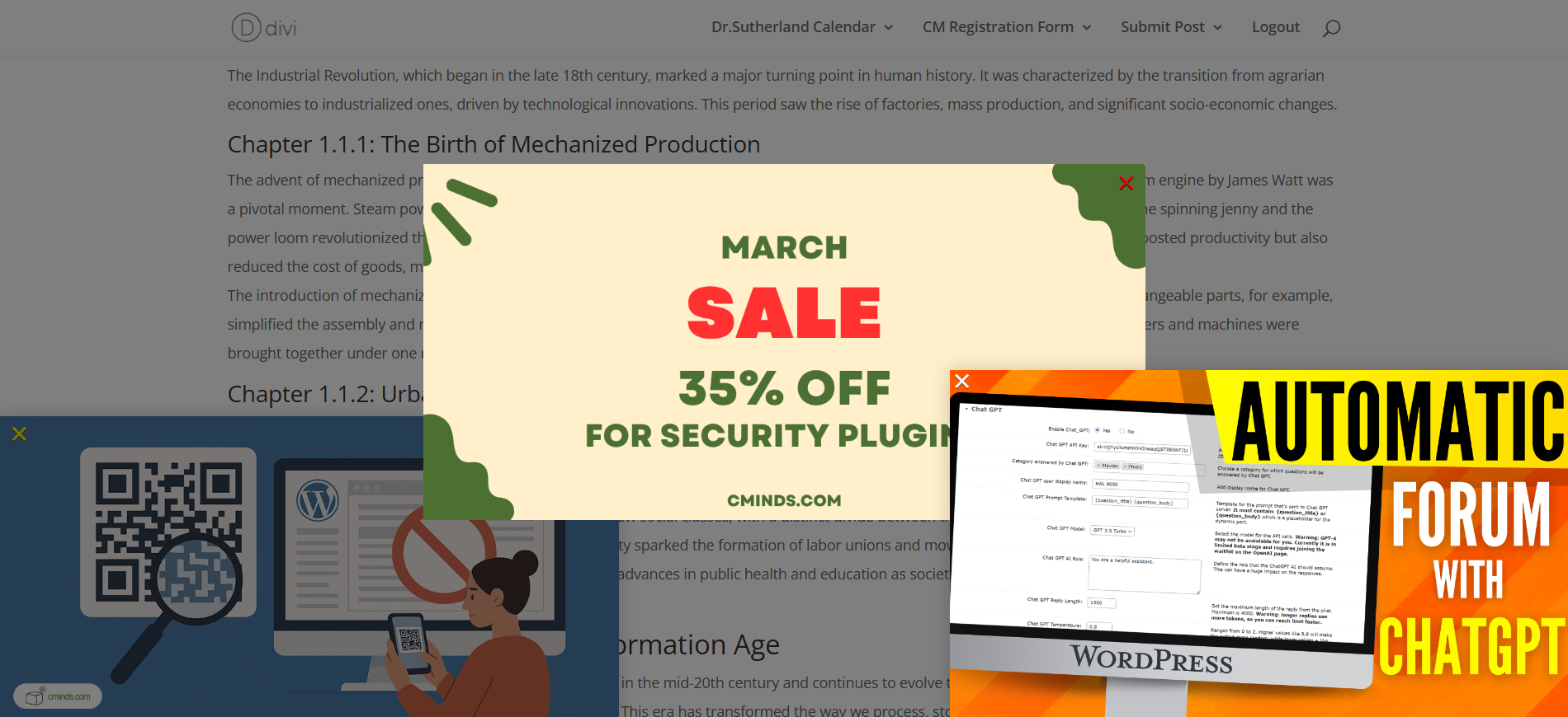
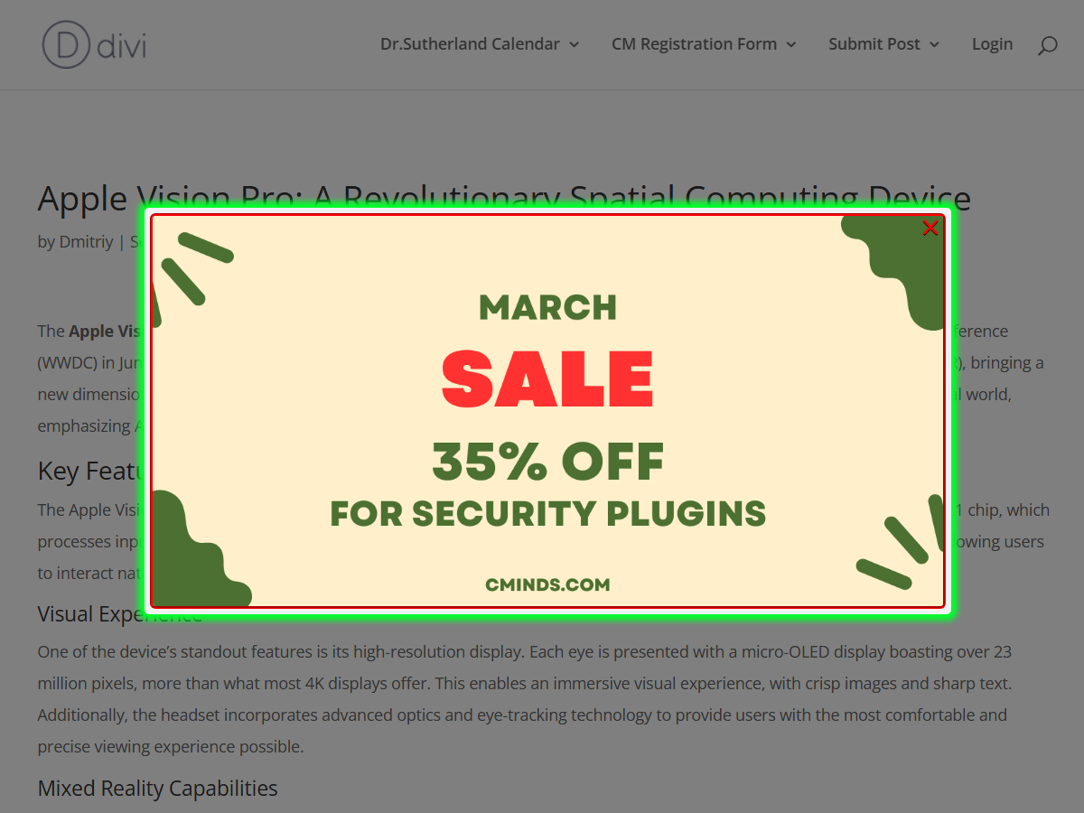
Popup Banner
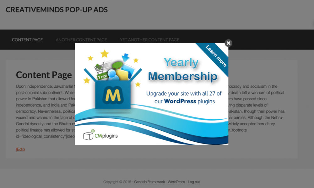
The popup banner can be text only, image only or a mix of both. In the above example, an image was used. You can also place a video inside the box if needed.
Fly-In Banner
Same for Fly-In. It just appears on the corner of the page.
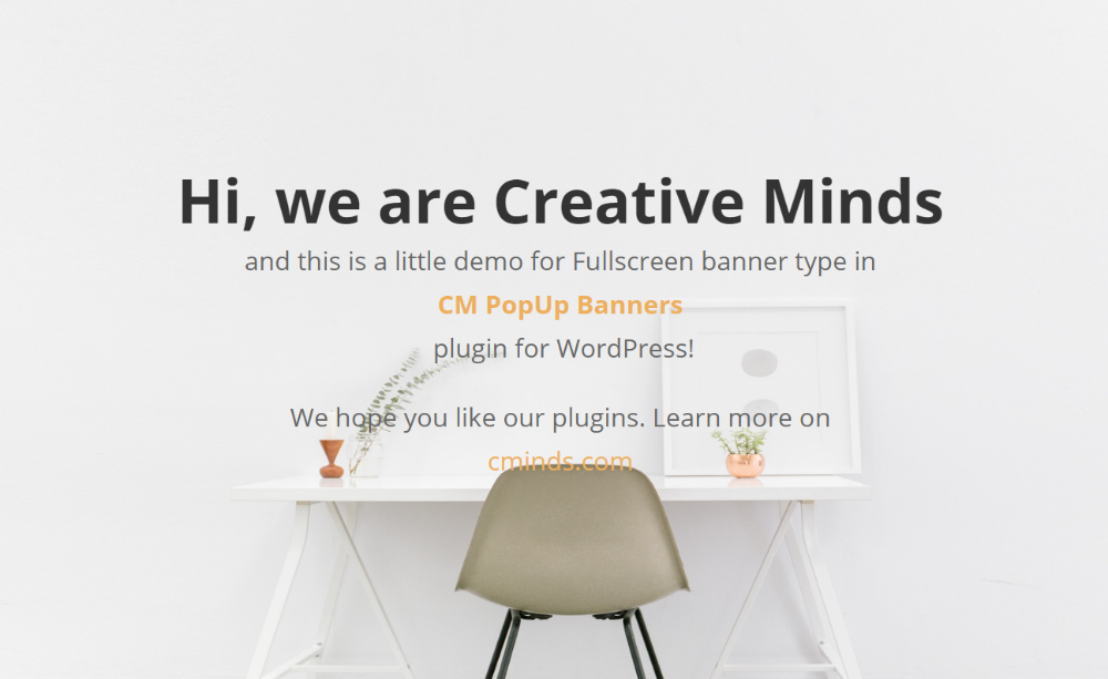
Full Page
Campaign Options
Basic Visual
In this section, you can define the size, shape and position of the popup.
Select the settings for the Basic Visual tab in the popup campaign options box.
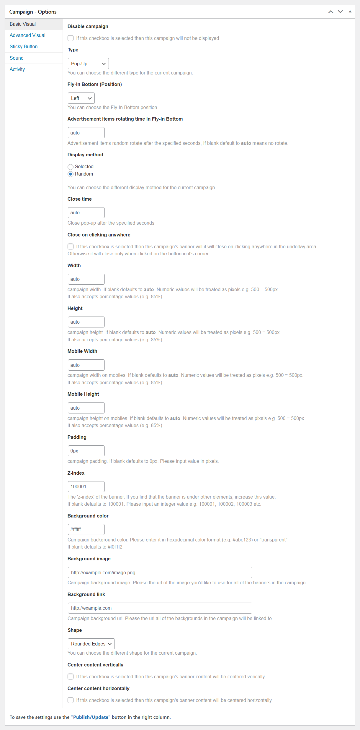
- Disable campaign - If this checkbox is selected, then this popup campaign will not be displayed.
- Type - Choose the type of popup campaign you want from the drop-down menu.
- Pop-Up - modal on the center of the screen, with tinted background.
- Fly-In Bottom - modal in the bottom right corner of the page.
- Full Screen - displays the modal on the full screen, with the background color covering the whole site.
- Fly-In Bottom (Position) - You can choose the Fly-In Bottom position. Choose between:
- Left
- Center
-
Right
Note: this option was introduced in version 1.5.4.
- Advertisement items rotating time in Fly-In Bottom - Set the time of rotating the popups within that campaign. The time is set in seconds. This option works only if you choose random way of displaying popups in the option Display method. Note: this option was introduced in version 1.5.4.
- Display method - Click the box to select the display method for the popup campaign, either Random or Selected. This is used when you have several items available for the same popup. Once selected is used and you have more than one item please choose the one you would like to show up.
- Close time - Close a popup after the specified seconds.
- Close on clicking anywhere - If this checkbox is selected, then this campaign's popup will close on clicking anywhere in the underlay area. Otherwise it will close only when clicked on the close-button in its corner.
- Width / Height - Enter values in the provided boxes for the campaign width and height. Accepted values include: numbers (in pixels), percents (eg 75%) or "auto".
- Mobile Width / Height - Enter values in the provided boxes for the campaign width and and height on mobile devices. Accepted values include: numbers (in pixels), percents (eg 75%) or "auto".
- Padding - Campaign padding. If blank defaults to 10px. Please input the value in pixels.
- Z-index - Allows to set the "z-index" of the popup. If you find that the popup is under other elements, increase this value. If the field is empty, the default value is set to 100,001. Please input an integer value (0-10000000000).
- Background color - Enter a value in the provided box for campaign background color. Accepts also "transparent".
- Background image - Campaign background image. Enter the URL of the image you'd like to use for all of the popups in the campaign.
- Background link - Campaign background URL. Enter the URL that the popups' background will link to.
- Shape - Choose the shape of the modal from the drop-down menu.
- Center content vertically / horizontally - If this checkbox is selected then this campaign's popup content will be centered vertically/horizontally.
TIP: Z-index
Since the version 1.7.0, the plugin allows to display a few popup campaigns at once on the same post/page. You can use the z-index setting to define the display priority. Popups with higher z-index values will appear in front, while those with lower values will appear behind. Example:
Advanced Visual
Note: the Advanced Visual tab was renewed in version 1.7.0 - lots of new options were added.
Define effects, delay, statistics count and behavior - when it appears and for how long.
The Advanced Visual tab consists of 2 basic areas:
- Sections with options.
- The Preview area where you can see how changed settings affect the front-end result.
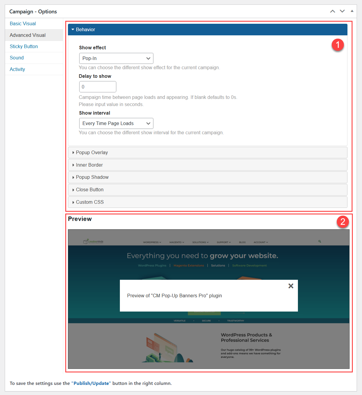
Let's consider the sections with settings one by one.
Behavior
Here you can define the behavior of how the popup appears - the show effect, the delay and how often it will show up for users. The settings are:
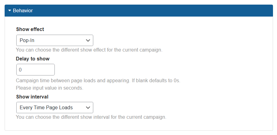
- Show effect - Choose a show effect for the popup campaign by selecting from the drop-down menu. The show effect will add animation in how the popups will appear.
- Delay to show - Enter a value in the provided box to choose the delay time before the popup appears on the page.
- Show interval - Choose a show interval for the popup campaign by selecting from the drop-down menu.
- Every Time Page Loads - When this option is selected the popup will be displayed every time, on each page where it's set to show
-
Only First Time Page Loads - When this option is selected, the popup will be displayed for each user once on all of the pages where it's set to show. When this option is chosen, a new option appears: Interval reset time - Set how many days after first impression the popup campaign should appear again. If blank defaults to 7 days.

Settings for popup show interval - Once on Any Page - When this option is selected the popup will be displayed just once per user. If it's set to show on multiple pages it will be displayed only on the first one of them.
-
Fixed number of times till reset - How many times popup campaign should be shown. The number of times is set in the appearing field Fixed number of times. Resets after the amount of days set in the field Interval reset time. This option is good when you want the user to see the campaign only X amount of time and to reset this count every Y days.

Settings for popup show interval


Popup Overlay
Here you can define if to add an overlay for the popup and choose the overlay type. The settings are:
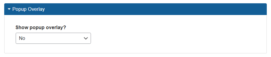
- Show popup overlay - You can choose between 3 options:
- No - The overlay will not be displayed.
-
Yes (Blur overlay) - The overlay will be blurred and you can define the degree of blur in the option Overlay Blur - the higher the value, the more blurred the overlay will be.

Blur overlay settings -
Yes (Color overlay) - When this option is chosen, you can define the overlay color using the option Overlay Color and define its transparency level using the option Transparency.

Color overlay settings


Front-end Example
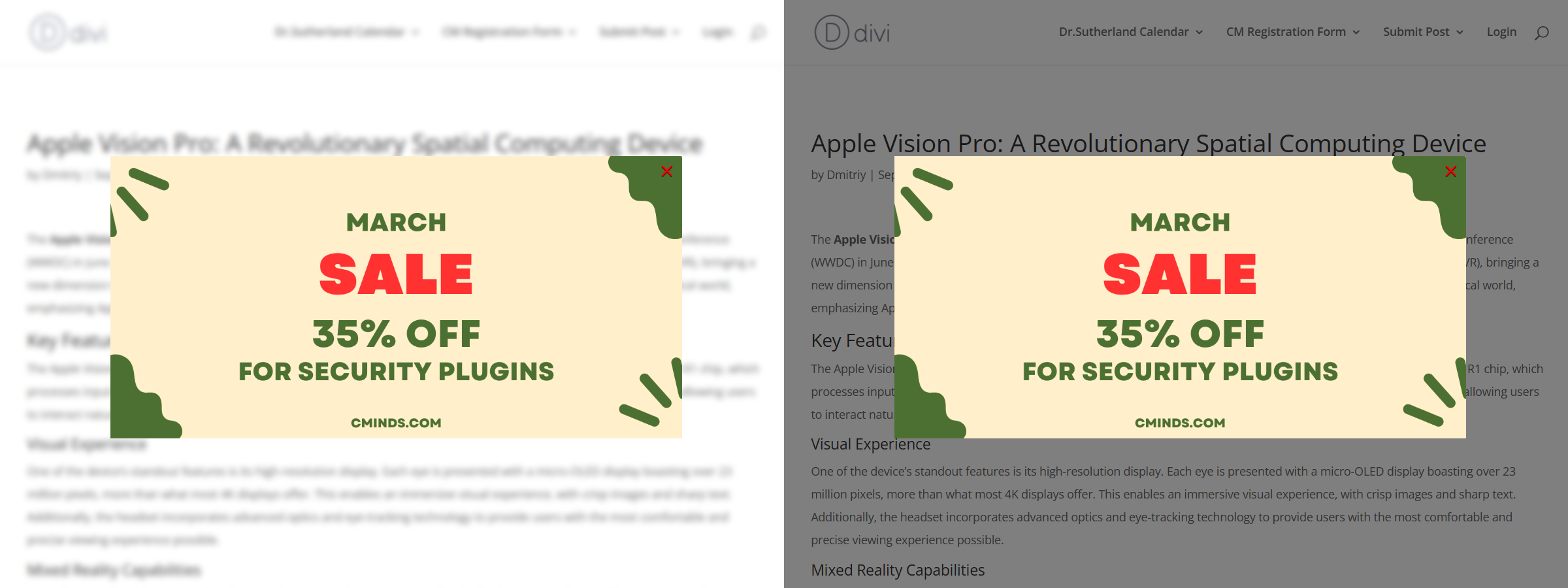
On the left side you can see an example with blur overlay, and on the right side - with the black and semi-transparent overlay.
Inner Border
This section allows you to add and configure a border for the popup. The settings are:
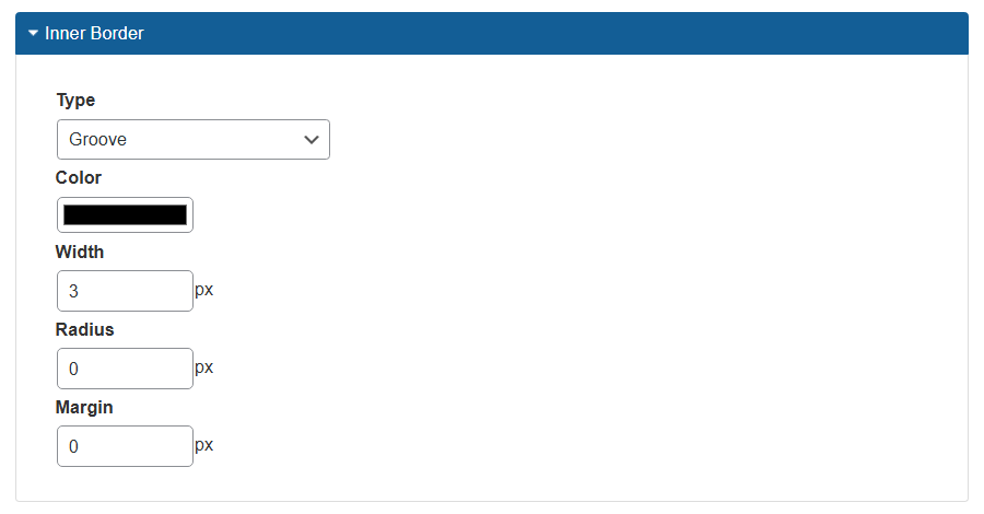
- Type - Choose a border type. Select None to disable it.
- Color - Choose the color for a border.
- Width - Define the border width.
- Radius - Define the border radius.
- Margin - Define the border margin.
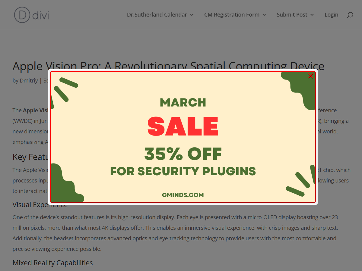
Front-end Example
Example of the inner border.
Popup Shadow
This section allows you to add and configure a popup shadow. The settings are:
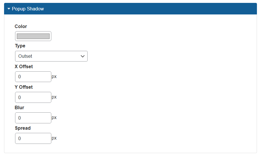
- Color - Choose the color of the popup shadow.
- Type - Choose the shadow popup between:
- None
- Inset
- Outset
- X Offset - Specify the horizontal offset.
- Y Offset - Specify the vertical offset.
- Blur - Specify how blurry the shadow should be.
- Spread - Specify the size of the shadow.
Front-end Example
Example of the outset green shadow.
Close Button
This section allows you to configure the appearance and position of the close button. The settings are:
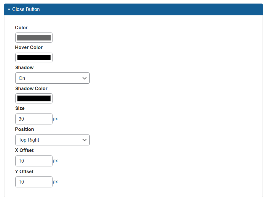
- Color - Choose the color of the close button.
- Hover Color - Choose the color of the close button on hover.
- Shadow - Choose if to display shadow for the close button.
- Shadow Color - Choose the color of the shadow.
- Size - Specify the size of the close button.
- Position - Choose where to show the close button:
- Bottom Left
- Bottom Right
- Top Left
- Top Right
- X Offset - Choose the offset of the close button from the left or right side of the popup.
- Y Offset - Choose the offset of the close button from the top or bottom side of the popup.
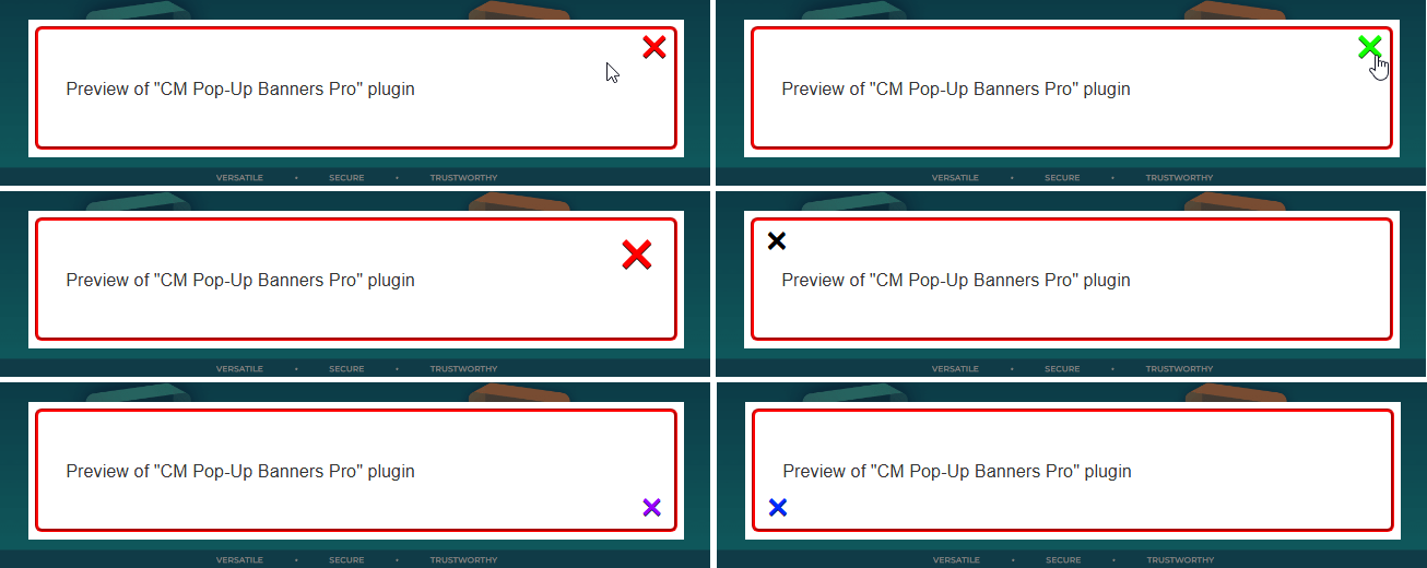
Front-end Example
A few examples with different positions, colors, sizes and offsets of a close button.
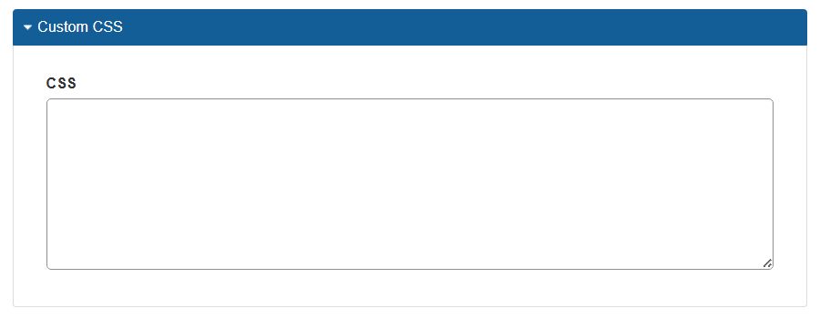
Custom CSS
This section provides a single option: a field to add custom CSS code for the popup campaign.
Sticky Button
Note: this section with settings was introduced in version 1.7.0.
As an alternative to automatic displaying of a popup, the sticky buttons feature allows you to display a button next to the screen side or in the corner, allowing users to launch the popup by clicking the button.
Front-end Example
The settings are:
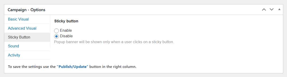
- Sticky button - When you choose Enable, a few new options appear.
The first option below is Type:
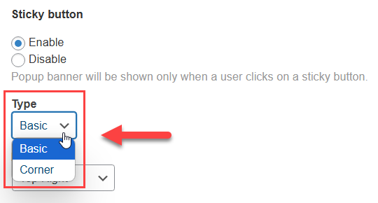
- Type - Here you can choose between 2 types of the button:
- Basic - In this case you can place the button next to one of the screen sides.
- Corner - In this case you can place the button to the corner.
There's a separate set of settings for each type, so let's consider both sets.
Preview
There's a live preview that allows you to see how the final button will look like on the front-end:
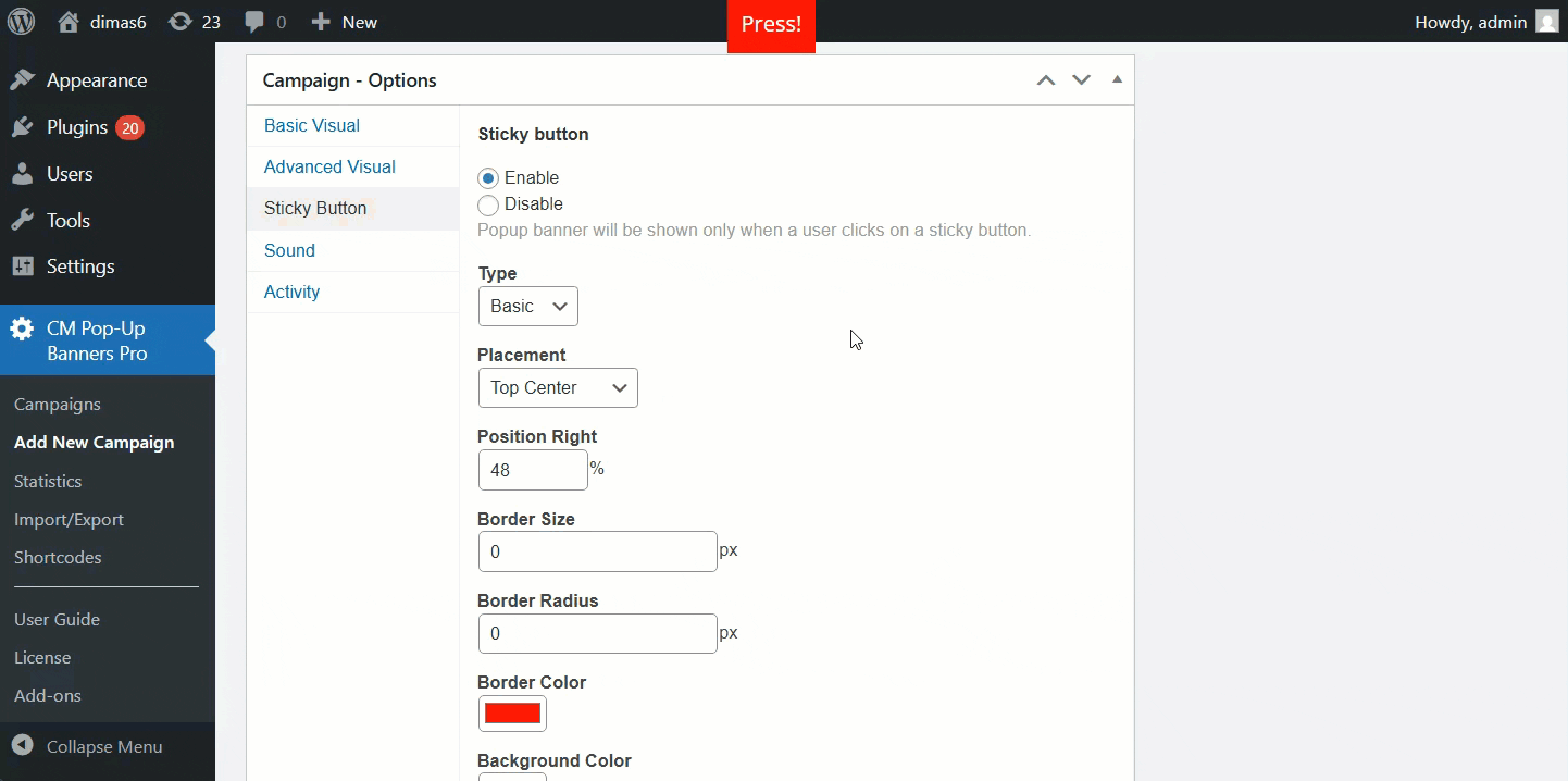
Basic Type Settings
The settings are:
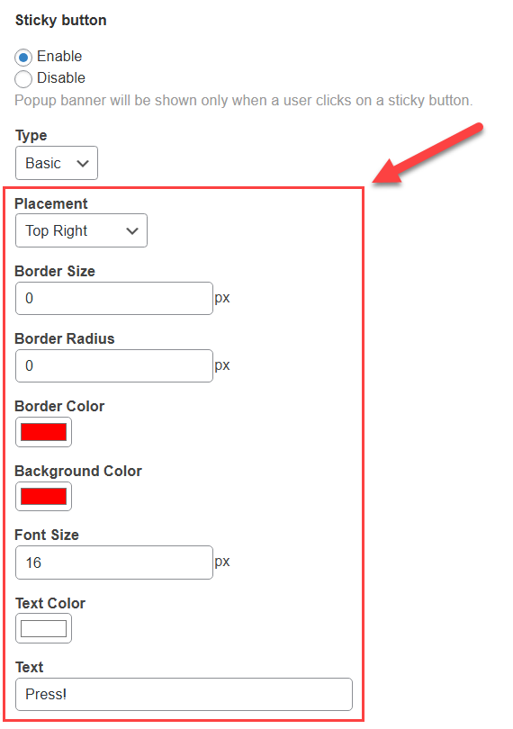
- Placement - Choose where to place the button. You can choose between:
- Top Left
- Top Center
- Top Right
- Left Center
- Right Center
- Bottom Left
-
Bottom Center
Bottom Right
Note: for those positions that contain a word "Center" in it, there appears one more option:
-
Position Right or Position Top - Allows adjusting the button position relative to the center.

Moving the button from the center
-
- Border Size - Allows to add a border and define its size.
- Border Radius - Allows to define the border radius.
- Border Color - Allows to define the border color.
- Background Color - Allows to define the button color.
- Font Size - Allows to define the font size of the text inside the button.
- Text Color - Allows to define the color of the text inside the button.
- Text - Allows to write a specific text inside the button.

Corner Type Settings
The settings are:
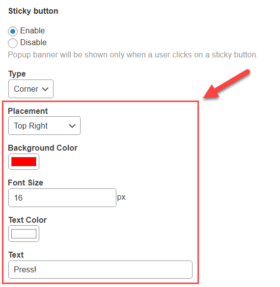
- Placement - Choose where to place the button. You can choose between:
- Top Left
- Top Right
- Bottom Left
- Bottom Right
- Background Color - Allows to define the button color.
- Font Size - Allows to define the font size of the text inside the button.
- Text Color - Allows to define the color of the text inside the button.
- Text - Allows to write a specific text inside the button.
Sound
Enable a sound triggered when the popup shows.
This tab allows selecting the sound effect accompanying the popup. It can work regardless of the type of campaign.
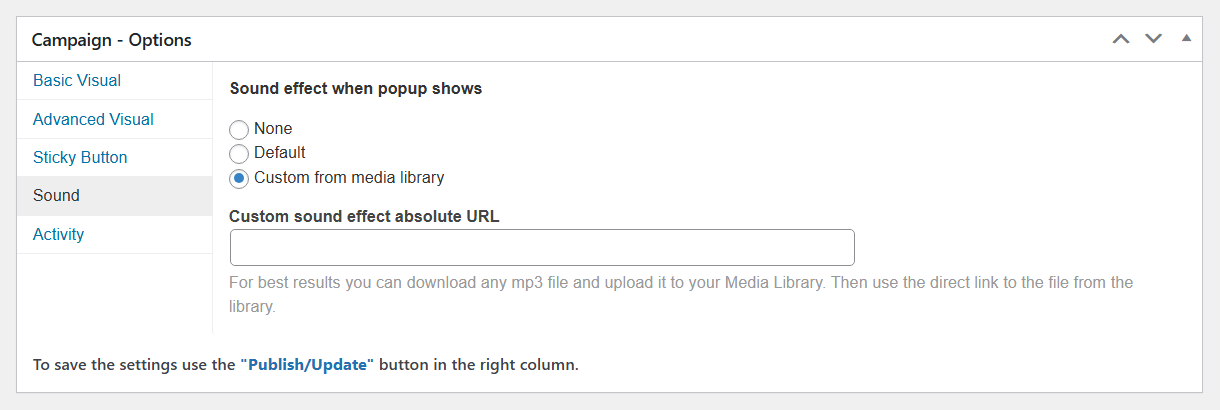
- Sound effect when the popup shows
- None - No sound will be played.
- Default - The generic sound bundled with the plugin will be played.
- Custom from media library - After selecting this option you'll need to provide the URL of the sound file you would like to play in the field Custom sound effect absolute URL. For the best results, you should first upload the mp3 file to your Library and copy its direct link.
Activity
Define where the popup will show and to which users/devices.
Select the settings for the Activity tab in the popup campaign options box.
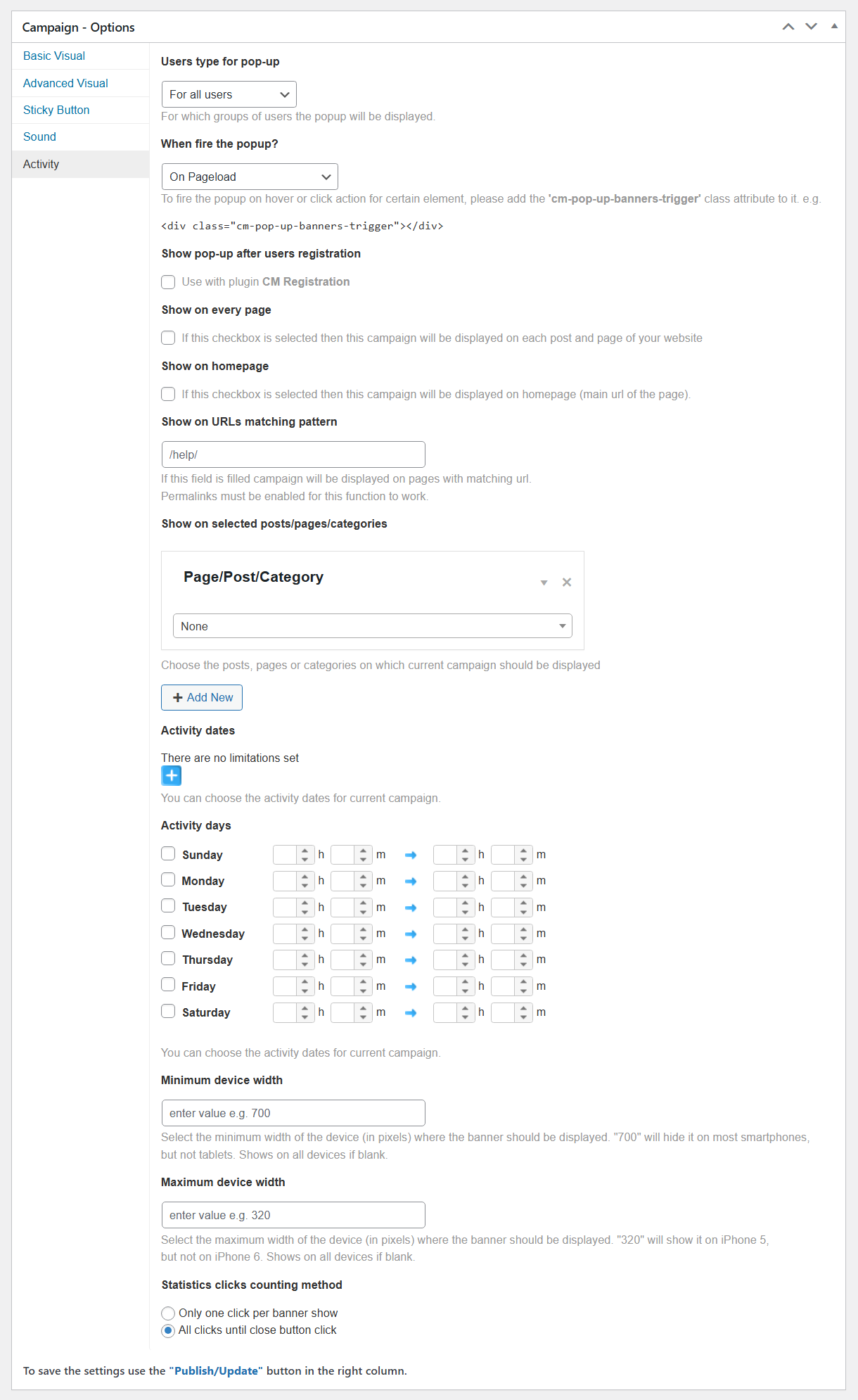
- User type for pop-up - Select which group of users will see the popup. The options are:
- All users
- Only logged-in
- Only non-logged-in (guests). Note: this was introduced in version 1.3.2.
- When fire the popup? - Choose when to fire the popup. Read more on this page. Choose between:
- On Pageload
- Element Click
- Element Hover
-
After inactive for X seconds - The amount of seconds is set in the appearing field Inactivity time.

Setting up the inactivity time - On page leave intent
-
Reaching the bottom of page - You can set the distance from the bottom of the page (closing / body tag) in the appearing option Bottom of page distance. Set the value in pixels. If blank defaults to 0px.

Setting up the page bottom distance
- Show pop-up after users registration - If this option is enabled, this popup will appear when a guest user successfully registers. It requires the WordPress Registration Form plugin.
- Show on every page - Check the box to display the campaign on all posts and pages.
- Show on homepage - Check the box to display the campaign on the homepage.
- Show on URLs matching pattern - Enter a url to display the popup campaign on the page. You can define a pattern in which this campaign will appear. It can be a category or a permalink path, for example your blog articles - /blog/. This will cover all URL with the following pattern /blog/*.
- Show on selected posts/pages/categories - Select from the drop down menu to choose the specific pages, posts or post categories the campaign will be displayed on. click the add a page button to add a page that is not listed. Note: the ability to choose post categories was added in version 1.6.0.
-
Activity dates - Determine if the popup campaign will show up only on specific dates. Click on the blue plus button to set an activation dates for the popup campaign. You can define multiple date range including the exact time per each.

Popup Activity dates settings -
Activity days - Run the popup campaign at the exact same time every week. You can specify more than one day for the recurring campaign activity.

Popup Activity dates settings - Minimum device width - Enter a value in the provided box to choose a minimum width for the campaign popup. This option let you limit the campaign to show only on non-mobile devices.
- Maximum device width - Similar to the previous option.
- Statistics clicks counting method - Choose an option for the statistics clicks counting method, either Only one click per banner show or All clicks until close button click. This will affect the information which is collected for the campaign statistics and reports.


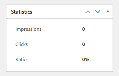
Statistics
Since version 1.7.0, you can see a metabox Statistics for tracking Impressions, Clicks and Ratio for the popup campaign. Learn more about the statistics in this user guide: WP Popup Plugin (CMP) - Statistics
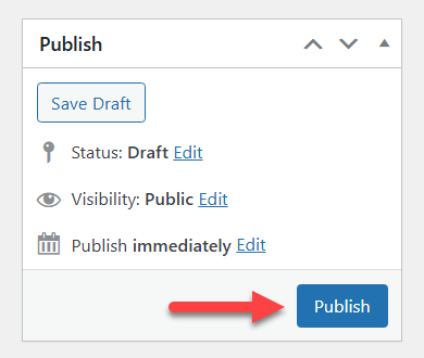
Saving the Changes
Click the button Publish to create a popup campaign, or button Update to save the changes in existing campaign.
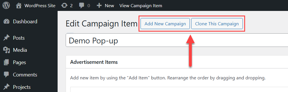
Alternative Way of Creating a Campaign
When the popup campaign is created, you can see two new buttons at the top of the page:
- Add New Campaign - Click this button to create a new popup campaign from scratch.
- Clone This Campaign - Click this button if you want to clone the current popup campaign with all its settings. Note: this option was introduced in version 1.6.0.
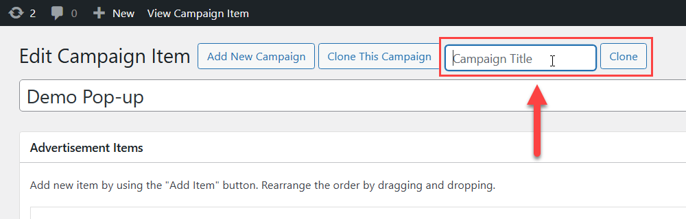
When you click Clone This Campaign, there appears a field where you need to give a name for a new popup campaign. Then click the button Clone to create it.
 |
More information about the WP Popup Plugin Other WordPress products can be found at CreativeMinds WordPress Store |
 |
Let us know how we can Improve this Product Documentation Page To open a Support Ticket visit our support center |