WP Popup Plugin (CMP) - Use Case - Add a Sticky Button That Opens a Popup on Click
Use Case - Add a Sticky Button That Opens a Popup on Click
Note: This guide covers features from the Pro version of WP Popup Plugin - This document uses version 1.7.2.
Introduction
This WP Popup Plugin allows you to show different kinds of popups on your website.
As an alternative to automatically displaying a popup, the plugin supports a sticky button feature that lets you display a button along the side of the screen or in a corner, allowing users to launch the popup by clicking the button.
Use Case Front-End
Basic sticky button example:
Corner sticky button example:
Use Case Assumptions
In this example use case guide, we'll cover how to display a popup that only appears when the user clicks a sticky button placed on the screen. We consider that you have already bought the plugin, but not installed it.
It follows:
Installing the Plugin
The process is the same for all CM plugins.
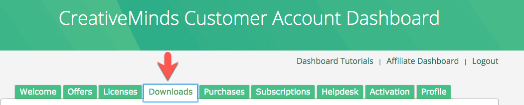
- Download the plugin from your customer dashboard.
- Log in to WordPress and navigate to the WordPress Admin → Plugins settings.
- Click on Add New.
- Activate it and add the license.
Learn more: Getting Started - Plugin Overview
Quick Recap
In this use case we will focus on how to display a popup by clicking a sticky button. To learn more about the basic process of creating popups, please check this use case guide:
Creating a Popup Campaign
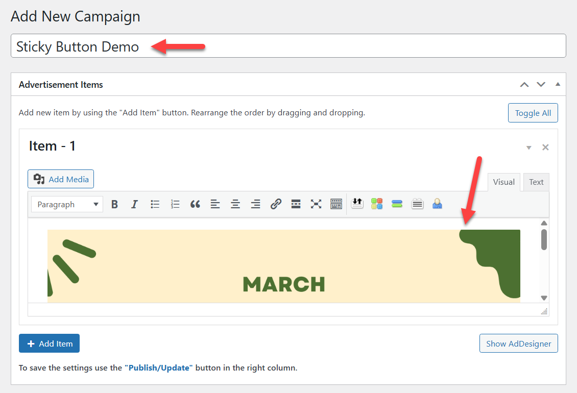
To create a popup campaign and configure a sticky button, navigate to Admin Dashboard → CM Pop-Up Banners Pro → Add New Campaign.

First, let's add a title and set up the banner content - we'll use a basic image for this example.
Below in the metabox Campaign - Options, we need the section Sticky Button.
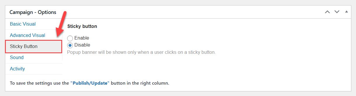
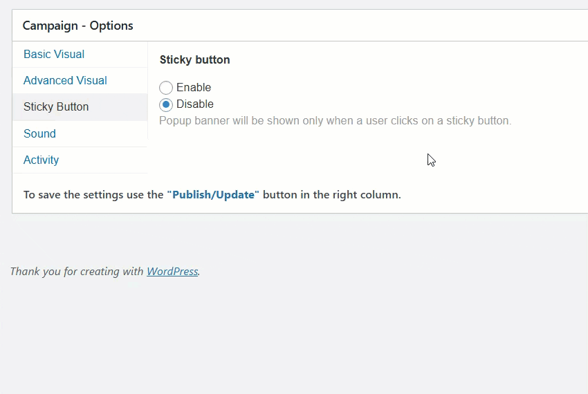
Here you can see an option Sticky button - choose Enable to turn on the feature. Once the option is enabled, a set of new options will appear below:
The first option below is Type - it allows you to choose between 2 types of the button:
- Basic - In this case, you can place the button along one of the sides of the screen.
- Corner - In this case, you can place the button in a corner of the screen.
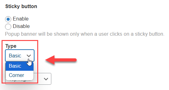
Each type has its own set of settings, so let’s review them separately.
Preview
There's a live preview that allows you to see how the final button will look like on the front-end:
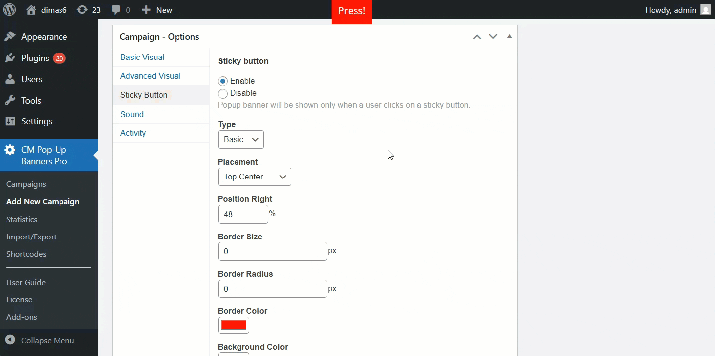
Basic Type Settings
The settings are:
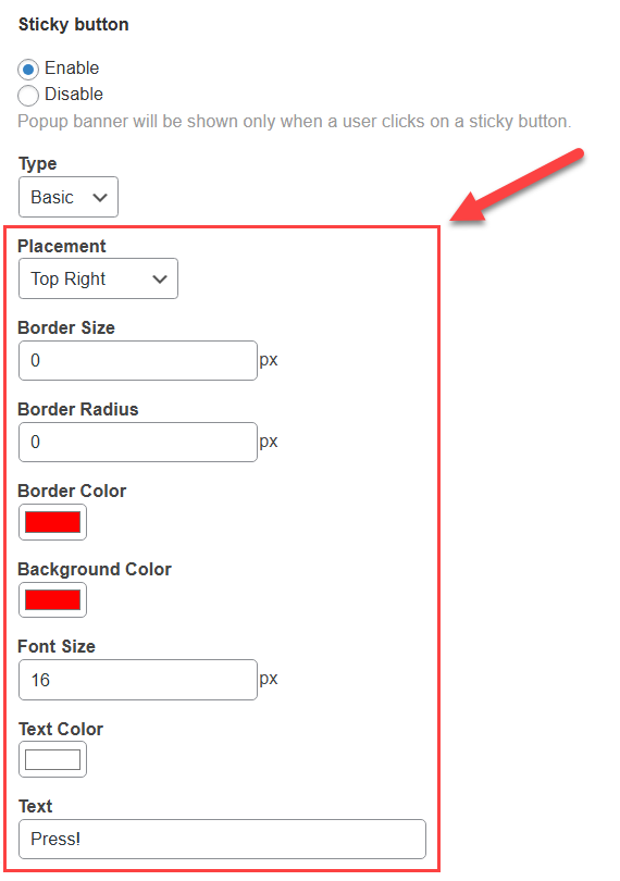
- Placement - Choose where to place the button. You can choose between:
- Top Left
- Top Center
- Top Right
- Left Center
-
Right Center
Bottom Left
Bottom Center
Bottom Right
Note: for positions that include the word "Center", an additional option appears:
-
Position Right or Position Top - Allows adjusting the button position relative to the center.

Moving the button from the center
-
- Border Size - Allows you to add a border and define its size.
- Border Radius - Allows you to define the border radius.
- Border Color - Allows you to define the border color.
- Background Color - Allows you to define the button color.
- Font Size - Allows you to define the font size of the text inside the button.
- Text Color - Allows you to define the color of the text inside the button.
- Text - Allows you to write a specific text inside the button.
Corner Type Settings
The settings are:
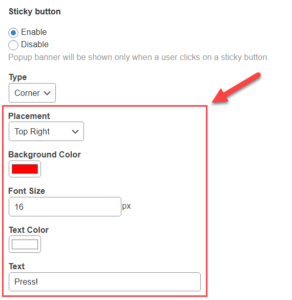
- Placement - Choose where to place the button. You can choose between:
- Top Left
- Top Right
- Bottom Left
- Bottom Right
- Background Color - Allows you to define the button color.
- Font Size - Allows you to define the font size of the text inside the button.
- Text Color - Allows you to define the color of the text inside the button.
- Text - Allows you to write a specific text inside the button.
To publish the popup campaign, click the button Publish in the relevant metabox:

Front-end Examples
Now, knowing the details about settings of each type, let's configure 2 different sticky button campaigns for the basic and corner types.
Basic Type Example
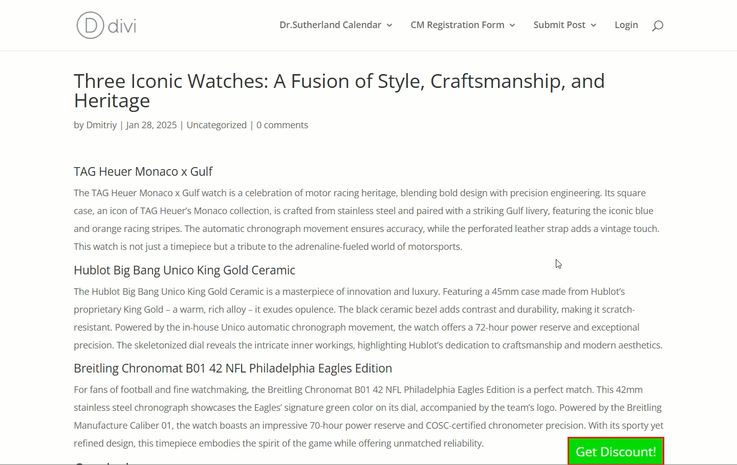
Let’s place the button at the bottom - not in the center or corner, but in a custom position on the right. The background color will be green, the border color will be red, the font color will be white, and the font size will be 20px. The button text will be "Get Discount!":
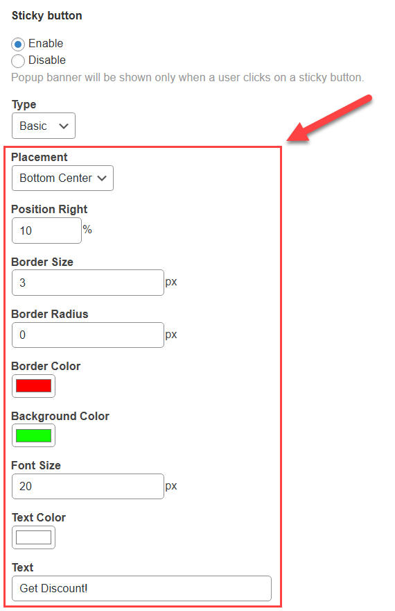
Front-end result:
Corner Type Example
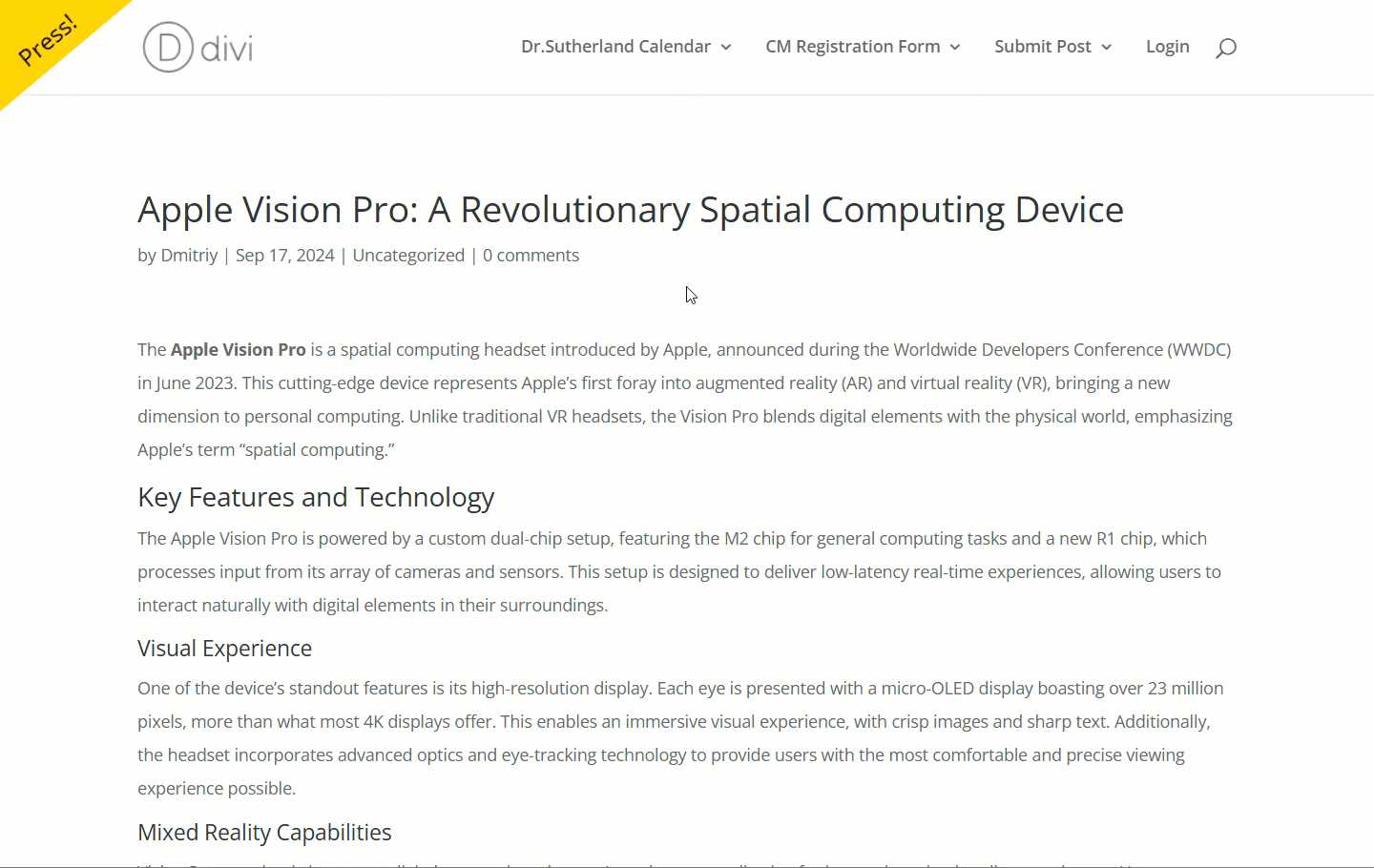
Let's place the button at the top left corner, with yellow background, black text, and the font size will be 20px. The button text will be the default: "Press!":
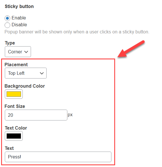
Front-end result:
Popup Dashboard
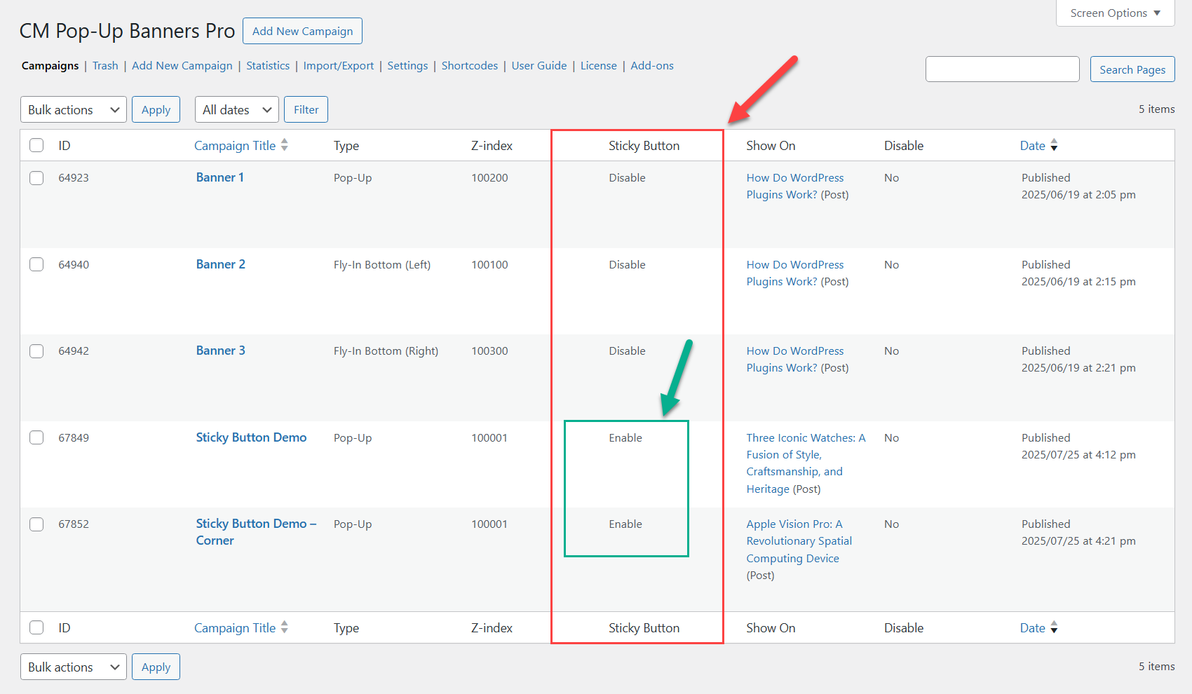
The plugin lets you see which popup campaigns have the sticky button feature enabled, directly from the campaign list in the dashboard. Navigate to Admin Dashboard → CM Pop-Up Banners Pro → Campaigns.

On that page you can see a table with all created popups. The Sticky Button column shows whether the sticky button feature is enabled for each popup campaign:
End Result
Following instructions found in the plugin and guides, you should be able to display a popup that appears only when the user clicks a sticky button on the screen.
Use Case Front-End
Basic sticky button example:
Corner sticky button example:
 |
More information about the WP Popup Plugin Other WordPress products can be found at CreativeMinds WordPress Store |
 |
Let us know how we can Improve this Product Documentation Page To open a Support Ticket visit our support center |