WordPress Glossary Plugin (CMTG) - Tooltips - Change the Tooltip Style
Control your Tooltip Style and Sizes
GDPR Compliance: Note that Tooltip Glossary uses Google Fonts. You can turn off Google Fonts by choosing "Tooltip font → default".
Learn more: WordPress Glossary Plugin (CMTG) - User Data Privacy and GDPR Compliance
This feature is only available in the Pro, Pro+ and Ecommerce editions of the WordPress Glossary plugin.
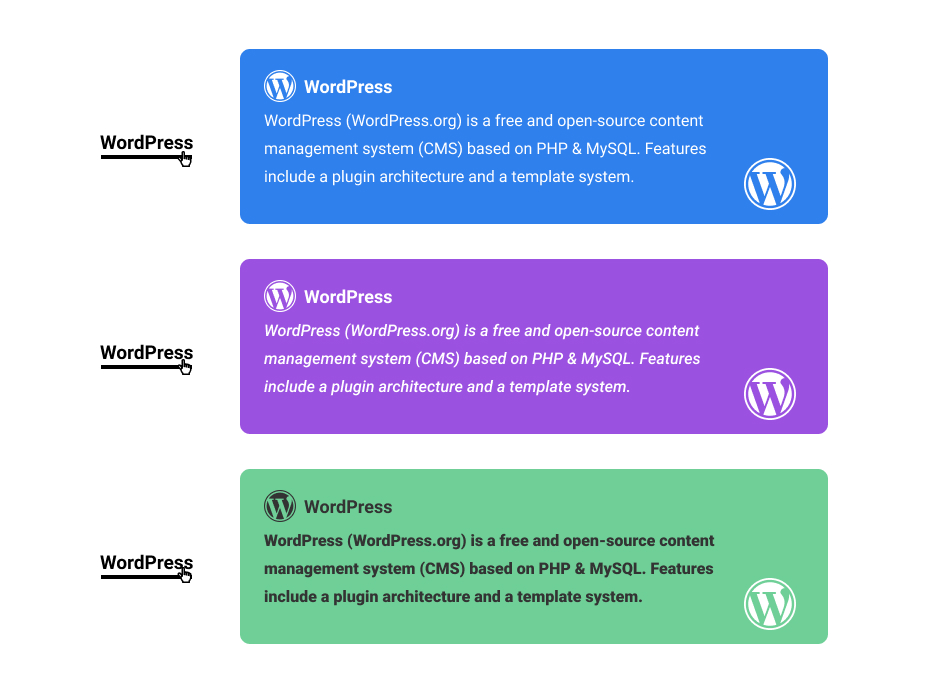
The eCommerce version boasts over 20 options to adjust the tooltip styling to your liking. Change the font, color, and size of the tooltip links that appear in your content, and create a distinct look for the terms in your content.
Three Examples of What You Can Achieve
Video Guide
Finding The Settings
All the settings related to the tooltip style are found in the plugin settings under Admin Dashboard → CM Tooltip Glossary → Settings → Tooltip tab.
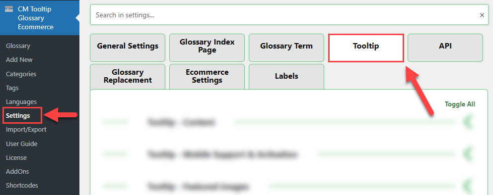
Then, head to the Tooltip - Styling section.

The options are:
- Desktop tooltip display method - Select the method of how tooltips should be displayed on desktop:
- Default - Displays a tooltip next to the term.
-
(new) Box - Displays a tooltip next to screen border - either at the bottom, on the left or on the right. The tooltip can be shown only on click with this method. You can choose the position in the option below.
Note: this option was introduced in version 4.5.1.
- Mobile tooltip display method - Select the method of how tooltips should be displayed on mobile devices:
- Default - Displays a tooltip next to the term.
-
(new) Box - Displays a tooltip at the bottom of the screen. The tooltip can be shown only on tap with this method.
Note: this option was introduced in version 4.5.1.
- Desktop tooltip-box position - Select where you would like to display tooltips on desktop when the method (new) Box is chosen. You can choose between:
- Bottom
- Right
-
Left
Note: this option was introduced in version 4.5.1.
Note: Learn more about (new) Box view in this guide: WordPress Glossary Plugin (CMTG) - Tooltips - Alternative Way To Show Tooltips
- Tooltip font - Set the font of the tooltip. You can disable Google Fonts by selecting "default" - this can be relevant for GDPR compliance. Learn more. Note: this option is available only in eCommerce version of the plugin.
- Show "Close" icon - Enable it to display "close" icon.
- Show "Close" icon only on mobile devices - Enable it to display "close" icon. Note: this option works only if Show "Close" icon option is enabled.
- Show stem? - If enabled, the stem will be displayed (only if tooltip location is Top/down). Note: this option is available only in eCommerce version of the plugin.
- Stem color - Set the color of a tooltip stem. Note: this option is available only in eCommerce version of the plugin.
- Close icon color - Set the color of the tooltip close icon.
- Close icon size - Set the size of the tooltip close icon.
- Close icon symbol - Set the symbol for the closed icons. You can use any of the WordPress dashicons. You just need to copy the dashicon slug. Default: 'dashicons-no'. Note: this option is available only in eCommerce version of the plugin.
- Tooltip background color - Set the color of the tooltip background.
- Tooltip text color - Set the color of the tooltip text.
- Force override all text colors in tooltip? - If enabled, then all of the texts in the tooltip (except for the special text and links) will have their colors overridden by the "Tooltip text color". Note: this option is available only in eCommerce version of the plugin.
- Tooltip title's font size - Set the font-size of the term title in the tooltip. Note: works only if the option Add term title to the tooltip content? is set.
- Tooltip title's text color - Set the color of the term title in the tooltip. Note: works only if the option Add term title to the tooltip content? is set.
- Tooltip title's background color - Set the color of the title's background in the tooltip. Note: works only if the option Add term title to the tooltip content? is set.
- Tooltip title align - Choose how to align a term title in the tooltip. Choose between:
- Auto
- Left
- Right
-
Center
Note: this option was introduced in version 4.4.0.
- Tooltip border - Set border styling (style, width, color).
- Tooltip title's line-height - Set line height of the term title in the tooltip. Works only if the option Add term title to the tooltip content is enabled. Note: this option was introduced in version 4.4.3.
- Tooltip content's line-height - Set line height of the term description in the tooltip. Note: this option was introduced in version 4.4.3.
- Tooltip rounded corners radius - Set rounded corners radius.
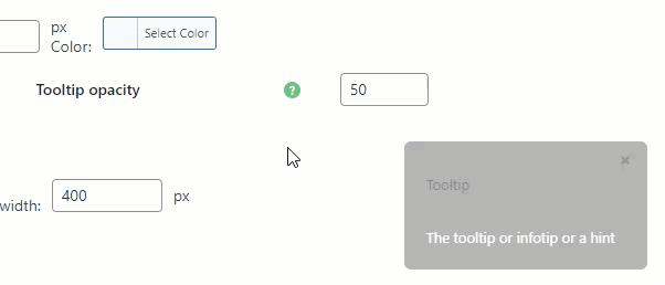
- Tooltip opacity - Set opacity of thee tooltip (0 is transparent, 100 is fully opaque).
- Tooltip z-index - Set tooltip z-index. Note: Z-index is a CSS property that defines the order of overlapping HTML elements. Increase the value, if the tooltip doesn't appear.
- Tooltip sizing - Set the minimal size of the tooltip in pixels.
- Tooltip placement - Choose the location of the tooltip.
- Tooltip positioning - Set the distance of tooltip's bottom left corner from the cursor pointer.
- Tooltip font size - Set the font size inside the tooltip.
- Tooltip padding - Set internal padding: top, right, bottom, left. Note: the eCommerce version of the plugin has 3 apart options instead of this one:
- Tooltip box padding
- Tooltip title padding
- Tooltip content padding
- Tooltip shadow - Enable this option if you want to show the shadow for the tooltip.
- Tooltip shadow color - Set the color of the shadow of the tooltip.
- Tooltip internal link color - Set the color of the links inside the tooltip.
- Tooltip edit link color - Set the color of the edit links in the tooltip. Note: works only if the option Add term editlink to the tooltip content? is set.
- Tooltip mobile link color - Set the color of the link to the term page in the tooltip. Note: works only if the mobile support is enabled.
TIP: Live Preview
You can see a live preview of all changes via a sample tooltip on the bottom right of the back-end.
This feature was introduced in version 3.9.0.
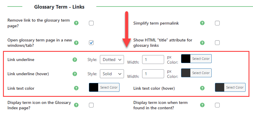
Changing your Tooltip Link Design!
All you have to do to style the Glossary link design is go into the plugin settings, and find the tab Glossary Term. Then head to the Glossary Term - Links section.
Now, you can control the link style on two main link statuses: as it appears when looking at the text, and as it appears when hovered with the mouse.
TIP
Some of the tooltip style settings can be overriden for specific glossary categories. Learn more about it in this guide: WordPress Glossary Plugin (CMTG) - Terms - Using Categories - Dividing Glossary Into Sections
 |
More information about the WordPress Glossary Plugin Other WordPress products can be found at CreativeMinds WordPress Store |
 |
Let us know how we can Improve this Product Documentation Page To open a Support Ticket visit our support center |